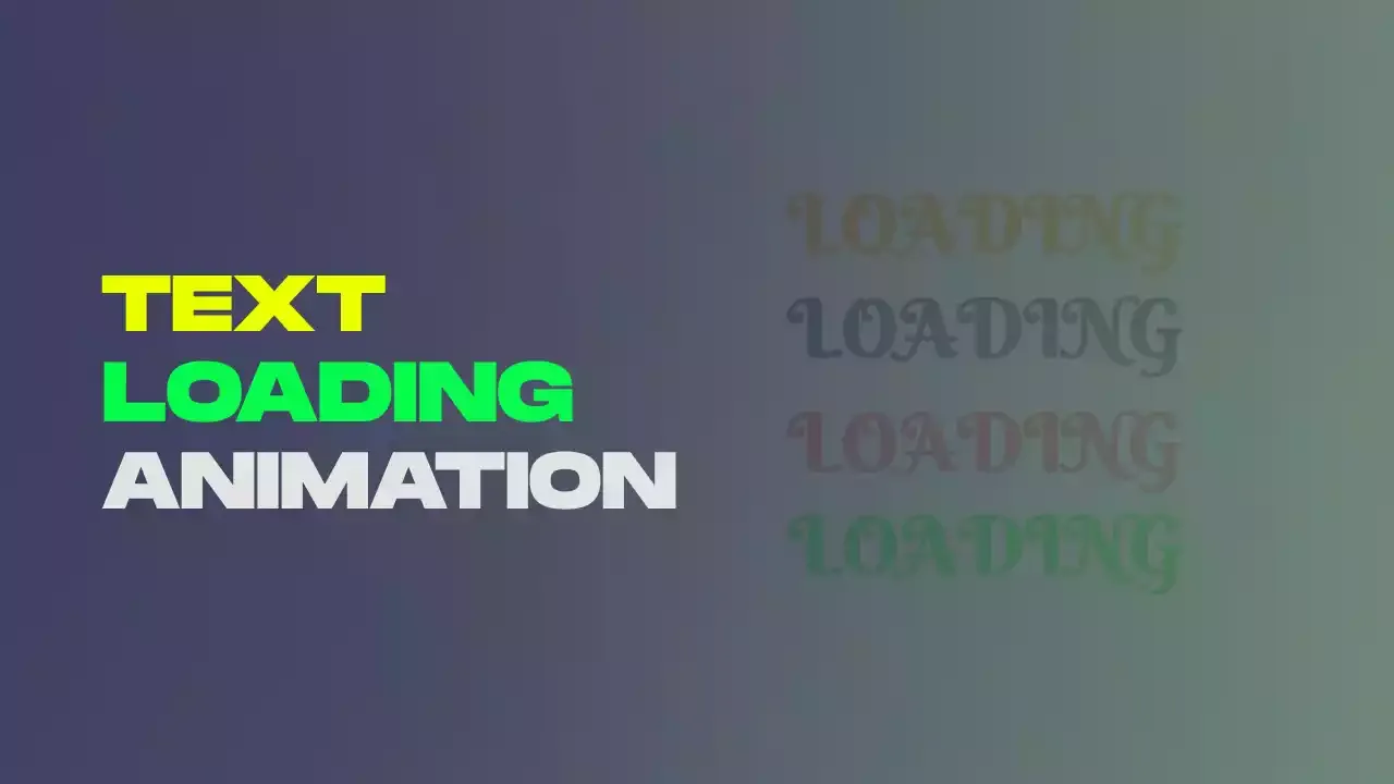
Text Loader Animation Using Html Css Only
"Text Loader Animation Using Only HTML and CSS" is a captivating approach to enhance your website with eye-catching loading animations. With just HTML and CSS, you can create dynamic text elements that change color as they load, providing an engaging visual experience for your website visitors.
In this animation text color transitions from various directions, such as left, right, top, and bottom, which not only adds a touch of excitement but also informs users that content is being loaded. This straightforward and visually appealing technique ensures that users stay engaged and informed during brief loading periods, enhancing their overall experience on your website.
For gsap animations, you can follow the gsap playlist. You can explore further articles on web development by checking out this list.
Table Of Contents
Read Also:
HTML:
Let's begin with the foundational structure of an HTML document, as depicted below.
<!DOCTYPE html>
<html>
  <head>
    <title>Text Loader Animation Using Html Css Only</title>
  </head>
  <body>
    // Content
  </body>
</html>
Now that we have established the basic HTML structure and ensured that all necessary dependencies are included in the HTML document, it is time to proceed with writing the HTML code, which is provided below.
<!DOCTYPE html>
<html>
<head>
  <title>Text Loader Animation | Rustcode</title>
  <link rel="stylesheet" href="style.css">
  <link rel="stylesheet" href="font.css">
</head>
<body>

  <div class="loader">
    Loading
  </div>

<script src="script.js"></script>
</body>
</html>
- This code sets up the structure for a webpage that can display a text loader animation, style it with CSS only.
- The page has a title set to "Text Loader Animation | Rustcode".
- It links to two external CSS files for styling: "style.css" and "font.css".
- Inside the <body> section, there's a <div> element with the class "loader".
- The <div> contains the text "Loading".
Output:
Read Also:
- Announcement Popup Box Using PopboxJs | Rustcode
- Cursor Animation With Hover Effect Using GSAP | HTML, CSS And GSAP
- Custom Mouse Cursor Javascript | HTML, CSS And PointerJs
- Html Elements Smooth Drag And Drop Animation | HTML, CSS And Sortable
- Particle Background Animation | HTML, CSS And ParticleJs
- Responsive Portfolio Landing Page | HTML, CSS, jQuery And GSAP
- Two Image Slider | HTML, CSS And JsPlugin
CSS:
* {
  margin:0;
  padding:0;
  box-sizing: border-box;
}

body {
  background-color: #e2e2e2;
  height: 100vh;
  display: flex;
  justify-content: center;
  align-items: center;
}

.loader {
  font-size: 4rem;
  font-family: 'Berkshire Swash', cursive;
  text-transform: uppercase;
  font-weight: 800;
  background: conic-gradient(
    #2B3A67 0 25%,
    #E84855 25% 50%,
    #f38609 50% 75%,
    #07ea1e 75%
  );
  background-size: 200% 200%;
  animation: textAnimation 3.5s ease-in-out infinite;
  color: transparent;
  background-clip: text;
  -webkit-background-clip: text;
}

@keyframes textAnimation  {
  25% {
      background-position: 0 100%;
  }

50% {
      background-position: 100% 100%;
  }

75% {
      background-position: 100% 0%;
  }

100% {
      background-position: 0 0;
  }
}
- It sets a consistent styling for all HTML elements using the universal selector * by removing margins, and padding, and specifying the box-sizing model.
- The body element is styled to have a light gray background color, occupy the entire viewport height (100vh), and center its content both horizontally (justify-content: center) and vertically (align-items: center).
- The text with the class "loader" is styled with a large font size, a specific font-family, uppercase text transformation, bold weight, and a unique multi-color gradient background created using conic-gradient. The background is animated with a keyframe animation called "textAnimation" for a continuous, looping effect.
- The textAnimation keyframes specify how the gradient background transitions at different points in the animation, creating the appearance of the colors moving through the text.
Output:
Read Also:
Read Also:
- Preloader Loading Animation | Html, Css And Gsap
- Social Media Buttons Animation With Rotation Hover Effect | Html & Css
- Pure CSS Progress Bar Animation | HTML And CSS
- Shining Effect On Text | HTML And CSS
- Show And Hide Password Animation | HTML, CSS And Javascript
- Simple Button Group Design | HTML And CSS
- Responsive Newsletter Subscription Form Design | HTML And CSS
- Responsive Price Table Design | HTML And CSS
Youtube Video:
We also made a youtube video for "Text Loader Animation Using Html Css Only", if you want to watch demo you can click on below video.
Read Also:
- Responsive Manual Image Slider | Html, Css & Javascript
- Skewed Background Design | HTML And CSS
- Snackbar Notification Animation | HTML, CSS And Javascript
- Progress Percentage Circle Design | HTML And CSS
- Round Switch Button Animation | HTML And CSS
- Responsive Automatic Image Slider | HTML CSS And JavaScript
- Simple Login Form Design | HTML And CSS
- 3D Airplane Animation With Mouse Parallax Effect Using Html Css And Gsap
- Crazy Toggle Button Animation Using Css Only
- Email Envelope Design Using Html Css Only
- Heart-Shape Design with Heartbeat Effect Using Html and Css
- Loader Inside The Square Box Using Html Css Only
- Responsive Newsletter Subscription Form Design | HTML And CSS
- SVG Hamburger Menu Using Html Css And Javascript
- Simple Heading With Hover Effect Using Html Css Only


Comments
Post a Comment