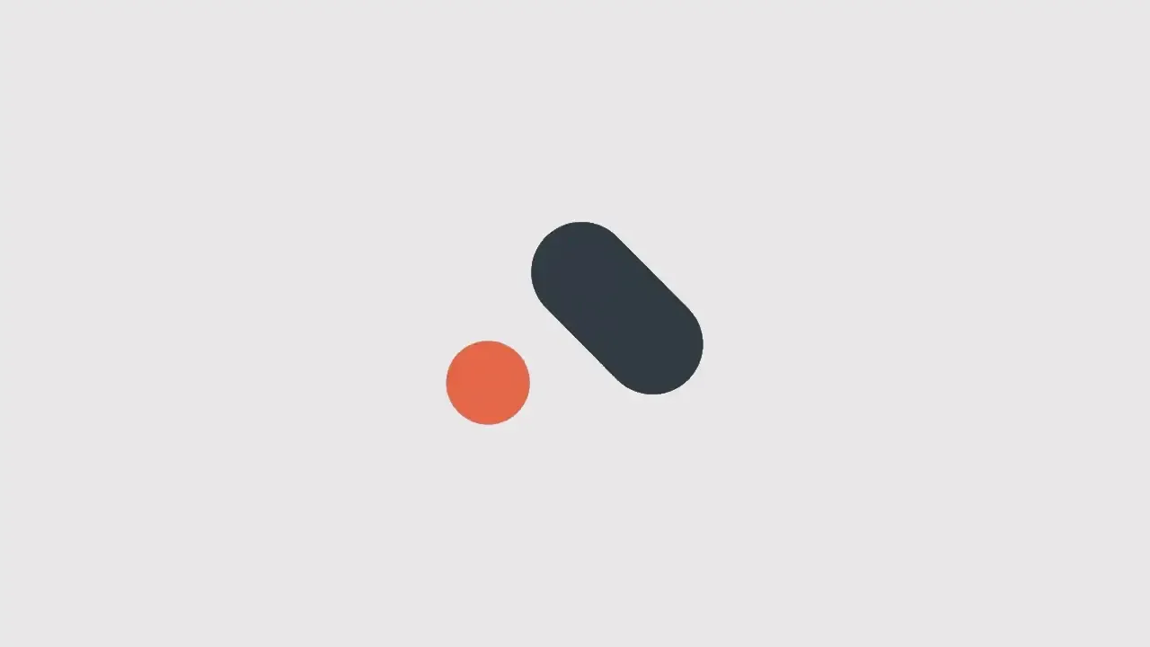
Crazy Toggle Button Animation Using Css Only
In today's fast-paced digital landscape, user interface design has become a critical aspect of creating engaging and memorable online experiences. One element that often takes center stage in web and app interfaces is the humble toggle button. While toggle buttons serve a functional purpose, they also offer a canvas for creativity and innovation.
In this article, we'll explore the exciting world of CSS animations and unveil a mesmerizing Crazy Toggle Button Animation that is achieved using CSS alone. Whether you're a seasoned web developer looking to add some flair to your projects or a budding designer eager to learn new techniques, this tutorial will take you on a journey to create a captivating toggle button animation that will undoubtedly leave a lasting impression on your users. So, buckle up and get ready to dive into the world of CSS wizardry!
For more button animations you can follow the button designs playlist.
You can read more about web development from this playlist.
Table Of Contents
Read Also:
HTML:
Let's begin with the foundational structure of an HTML document, as depicted below.
<!DOCTYPE html>
<html>
<head>
  <title>//Content</title>
</head>
<body>

  <input type="checkbox">

</body>
</html>
Now that we have established the basic HTML structure and ensured that all necessary dependencies are included in the HTML document, it is time to proceed with writing the HTML code, which is provided below.
<!DOCTYPE html>
<html>
<head>
  <title>Crazy Toggle Button Animation Using Css Only</title>
</head>
<body>

  <input type="checkbox">

</body>
</html>
Read Also:
CSS:
input {
  --s: 100px; /* control the size */
  --d: 0.7s; /* the transition duration */

  height: var(--s);
  border: calc(var(--s) / 10) solid #0000;
  box-sizing: content-box;
  aspect-ratio: 2.2;
  border-radius: var(--s);
  background: #313b45;
  -webkit-appearance: none;
  -moz-appearance: none;
  appearance: none;
  cursor: pointer;
  transition: 0.3s;
  position: relative;
  transition: var(--d);
  outline-offset: 5px;
}
input:before {
  content: "";
  position: absolute;
  top: 0;
  left: 0;
  width: var(--s);
  aspect-ratio: 1;
  border-radius: 50%;
  background: #fe5945;
  transition: var(--d), top cubic-bezier(0.1, 3000, 0.9, -3000) var(--d),
    left cubic-bezier(0.5, 3000, 0.5, -3000) calc(4 * var(--d) / 5)
      calc(var(--d) / 5);
}
input:checked:before {
  top: 0.2px;
  left: 0.3px;
  transform: translate(120%);
  background: #27c86a;
}
input:checked {
  transform: rotate(1turn);
}
body {
  margin: 0;
  height: 100vh;
  display: grid;
  grid-auto-flow: column;
  place-content: center;
  align-items: center;
  gap: 40px;
}
Read Also:
Read Also:
Youtube Video:
We also made a youtube video for "Crazy Toggle Button Animation Using Css Only", if you want to watch demo you can click on below video.
Read Also:
- Bookmark Interaction Animation | Html Css And Gsap
- Cursor Animation With Hover Effect Using GSAP | HTML, CSS And GSAP
- Full Screen Responsive Overlay Navigation Bar Design Using GSAP | HTML ,CSS And GSAP
- Gaming CPU Landing Page Design Using GSAP | HTML, CSS And GSAP
- Page Loading With Intro Using GSAP | HTML, CSS And GSAP
- Page Transition Animation Using GSAP | HTML, CSS And GSAP
- Portfolio Landing Page With Animation And Responsiveness | HTML, CSS, jQuery And GSAP
- Website Loader Animation Using GSAP | HTML, CSS And GSAP
- Announcement Popup Box Using PopboxJs | Rustcode
- Cursor Animation With Hover Effect Using GSAP | HTML, CSS And GSAP
- Custom Mouse Cursor Javascript | HTML, CSS And PointerJs
- Html Elements Smooth Drag And Drop Animation | HTML, CSS And Sortable
- Particle Background Animation | HTML, CSS And ParticleJs
- Portfolio Landing Page With Animation And Responsiveness | HTML, CSS, jQuery And GSAP
- Two Image Slider | HTML, CSS And JsPlugin


Comments
Post a Comment