Sticky Navigation Bar Design With Css Only
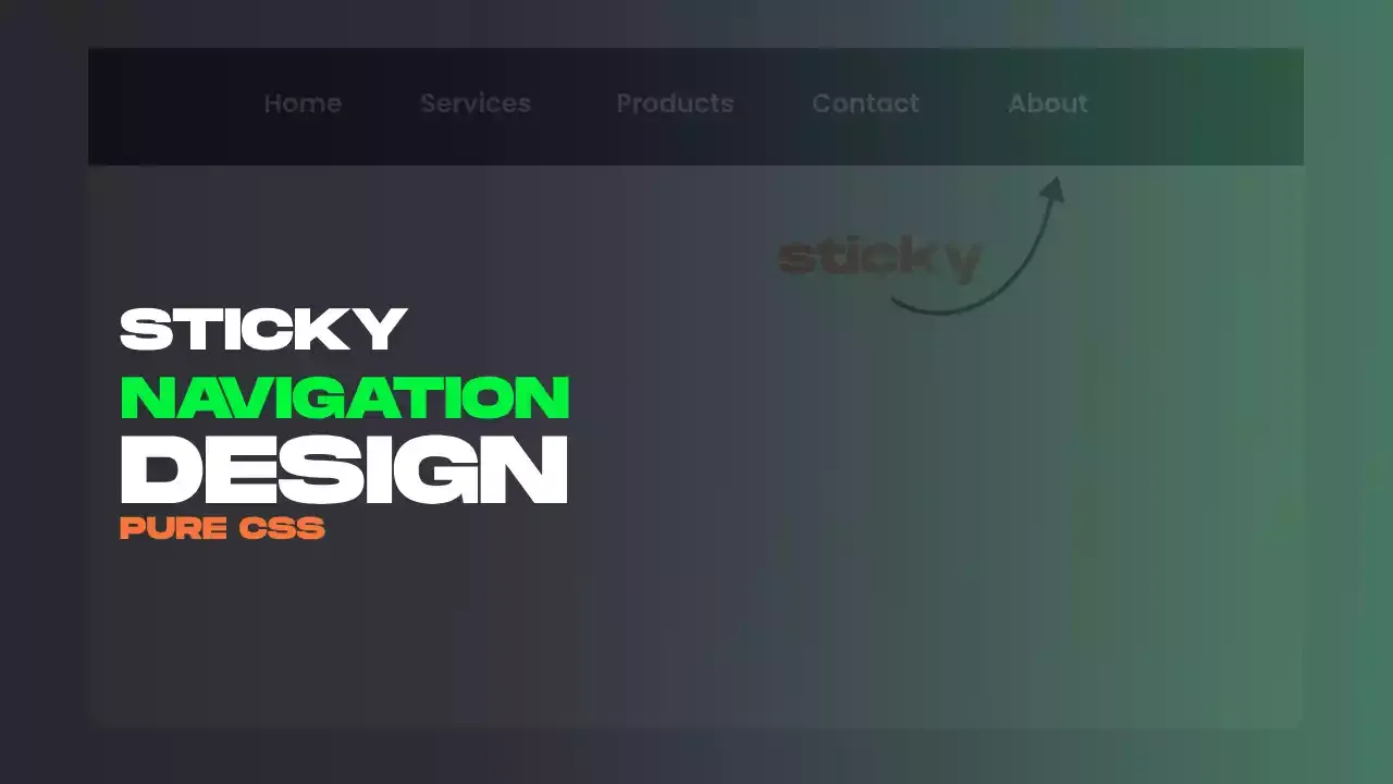
"Sticky Navigation Bar Using Only CSS" is a clever way to make a website's navigation stay at the top of the page as you scroll down. It's done without any fancy programming, just by using the power of CSS. This technique makes it easier for people to navigate a website, as the menu is always right there at the top, no matter how far they've scrolled. It's a simple but effective design trick that improves the user experience.
For gsap animations, you can follow the gsap playlist. You can explore further articles on web development by checking out this list.
Table Of Contents
Read Also:
HTML:
Let's begin with the foundational structure of an HTML document, as depicted below.
<!DOCTYPE html>
<html>
  <head>
    <title>Sticky Navigation Bar Design With Css Only</title>
  </head>
  <body>
    // Content
  </body>
</html>
Now that we have established the basic HTML structure and ensured that all necessary dependencies are included in the HTML document, it is time to proceed with writing the HTML code, which is provided below.
<!DOCTYPE html>
<html>
<head>
  <title>Sticky Navigation Bar Design With Css Only | Rustcode</title>
  <link rel="stylesheet" href="style.css">
  <link rel="stylesheet" href="font.css">
</head>
<body>

  <nav>
    <ul>
      <li><a href="#">Home</a></li>
      <li><a href="#">Services</a></li>
      <li><a href="#">Products</a></li>
      <li><a href="#">Contact</a></li>
      <li><a href="#">About</a></li>
    </ul>
  </nav>

  <section></section>
  <br>

  <section></section>
  <br>

  <section></section>
  <br>

  <section></section>
  <br>


<script src="script.js"></script>
</body>
</html>
-
This is a basic web page structure written in HTML.
-
It features a navigation bar at the top.
-
The navigation bar includes links for "Home," "Services," "Products," "Contact," and "About."
-
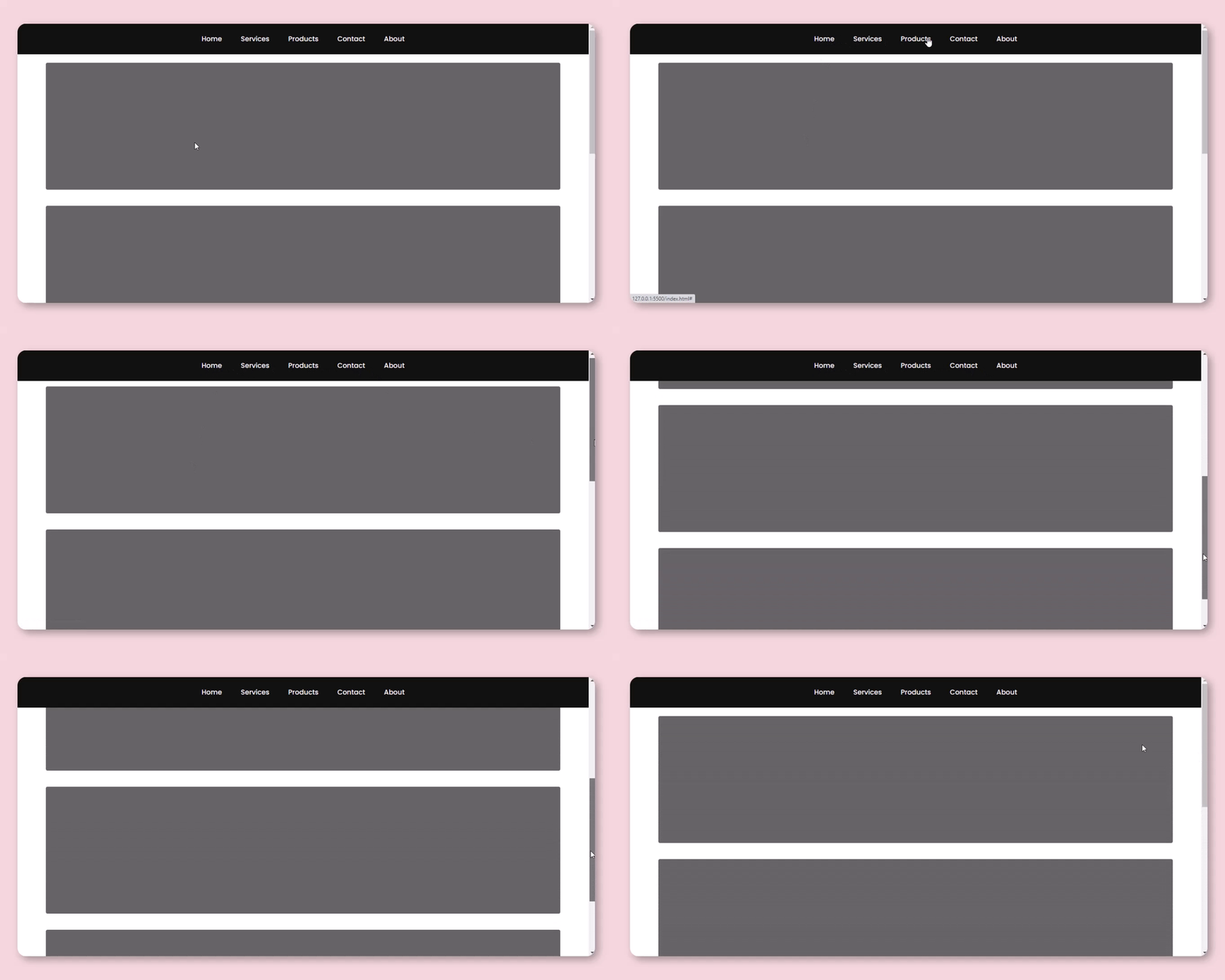
As you scroll down the page, the navigation bar sticks to the top of the browser window, so it's always visible.
-
The page includes multiple
<section>elements, which can be used to add content or sections to the webpage. -
It references external stylesheets ("style.css" and "font.css") to control the page's appearance.
Output:
CSS:
*{
  margin: 0;
  padding: 0;
  box-sizing: border-box;
}

body{
  background-color: #fff;
}

section{
  margin: auto;
  background-color: #3f3f3f;
  opacity: 0.8;
  width: 90%;
  height: 300px;
  border-radius: 4px;
  margin-top: 20px;
}

nav{
  background-color: #111;
  display: flex;
  justify-content: center;
  padding: 1.5em 0;
  position: sticky;
  top: 0;
  z-index: 10;
}

ul{
  display: flex;
  list-style-type: none;
}

li{
  margin: 0 1.4em;
}

li a{
  font-size: 1rem;
  font-weight: 500;
  font-family: Poppins;
  color: whitesmoke;
  text-decoration: none;
}

@media(max-width:576px){
  li {
    font-size: 0.85rem;
    margin: 0 1em;
  }

  section{
    width: 96%;
    height: 200px;
  }
}
-
The * selector sets some default styles for all elements on the page. It removes any margin or padding around them and ensures that they are sized correctly within their containers.
-
The body selector sets the background color of the whole webpage to white (#fff).
-
The section selector styles a specific part of the webpage. It gives it a dark gray background with some transparency, and rounded corners, and positions it in the center of the page.
-
The nav selector styles the navigation bar at the top of the page. It gives it a dark background, makes it stick to the top of the page even when you scroll down, and ensures it's on top of other elements (z-index).
-
Inside the navigation bar (nav), there's an unordered list (ul) that contains list items (li). These list items are styled to be evenly spaced and contain links (li a) with a specific font, color, and no underline.
-
The @media query at the bottom applies different styles if the screen width is less than or equal to 576 pixels. It makes the text smaller and adjusts the section's width and height to fit better on smaller screens.
Read Also:
- 09+ Most Popular RESTful API Frameworks Of PHP
- 12+ Best Competitive Coding Challenge Websites
- 12+ Shortcut Keys Of Visual Studio Code Editor
- 15+ Best Visual Studio Code Extensions For Web Development
- 09+ Most Popular Blogs To Learn Web Development
- 06+ Top Online Websites To Learn HTML And CSS
- 07+ Best Free Blogging Platform To Make Money
- 07+ Best Google Fonts Collection For Website
Read Also:
- Announcement Popup Box Using PopboxJs | Rustcode
- Cursor Animation With Hover Effect Using GSAP | HTML, CSS And GSAP
- Custom Mouse Cursor Javascript | HTML, CSS And PointerJs
- Html Elements Smooth Drag And Drop Animation | HTML, CSS And Sortable
- Particle Background Animation | HTML, CSS And ParticleJs
- Responsive Portfolio Landing Page | HTML, CSS, jQuery And GSAP
- Two Image Slider | HTML, CSS And JsPlugin
Youtube Video:
We also made a youtube video for "Sticky Navigation Bar Design With Css Only", if you want to watch demo you can click on below video.
Read Also:
- Preloader Loading Animation | Html, Css And Gsap
- Social Media Buttons Animation With Rotation Hover Effect | Html & Css
- Pure CSS Progress Bar Animation | HTML And CSS
- Shining Effect On Text | HTML And CSS
- Show And Hide Password Animation | HTML, CSS And Javascript
- Simple Button Group Design | HTML And CSS
- Responsive Newsletter Subscription Form Design | HTML And CSS
- Responsive Price Table Design | HTML And CSS
- Navigation Bar With Hover Line Effect Using HTML And CSS


Comments
Post a Comment