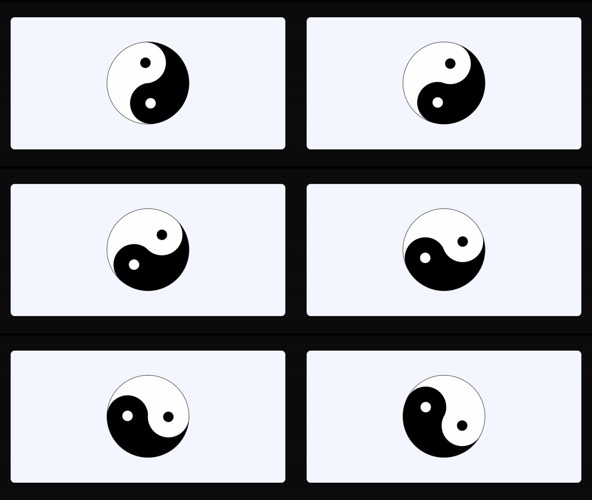
Yin and Yang Design With Single Div Using Html Css
"Yin and Yang Design With Single Div Using HTML, CSS" is a creative approach to web design that demonstrates the harmonious balance between contrasting elements. In this design, a single HTML <div> element, combined with the power of CSS, is used to create a visually captivating representation of the Yin and Yang concept. By leveraging the principles of light and dark, this technique showcases the beauty of simplicity in web development. For gsap animations you can follow the gsap playlist. You can explore further articles on web development by checking out this list.
Table Of Contents
Read Also:
HTML:
Let's begin with the foundational structure of an HTML document, as depicted below.
<!DOCTYPE html>
<html>
  <head>
    <title>Yin and Yang Design With Single Div Using Html Css</title>
  </head>
  <body>
    // Content
  </body>
</html>
Now that we have established the basic HTML structure and ensured that all necessary dependencies are included in the HTML document, it is time to proceed with writing the HTML code, which is provided below.
<!DOCTYPE html>
<html>
<head>
  <title>Yin and Yang Design With Single Div | Rustcode</title>
  <link rel="stylesheet" href="style.css">
</head>
<body>

<div></div>


</body>
</html>
Read Also:
CSS:
body {
  display: flex;
  justify-content: center;
  align-items: center;
  height: 100vh;
  margin: 0;
  overflow: hidden;
}

/* outer circle */
div {
  box-sizing: border-box;
  width: min(30vw, 95vmin);
  aspect-ratio: 1;
  border-radius: 50%;
  background-color: white;
  border: 0.15rem solid black;
  overflow: hidden;
  animation: rotate 20s linear infinite;
}

/* rotation animation */
@keyframes rotate {
  to {
    rotate: 1turn;
  }
}

/* yin and yang circles */
div::after {
  content: "";
  position: absolute;
  inset: 0;
  background-image: radial-gradient(
      closest-side circle at 50% 25%,
      black,
      black 25%,
      white calc(25% + 1px),
      white 100%,
      transparent calc(100% + 1px)
    ),
    radial-gradient(
      closest-side circle at 50% 75%,
      white,
      white 25%,
      black calc(25% + 1px),
      black 100%,
      transparent calc(100% + 1px)
    );
}

/* circle background */
div::before {
  content: "";
  position: absolute;
  inset: 0;
  background-image: linear-gradient(
    to right,
    white,
    white 50%,
    black 50%,
    black
  );
  z-index: -1;
}

@media (prefers-color-scheme: dark) {
  body {
    background-color: black;
  }
  div {
    border-color: white;
  }
}
Output:
Read Also:
- Shining Effect On Text | HTML And CSS
- Show & Hide Password | HTML, CSS And Javascript
- Simple Button Group Design | HTML And CSS
- Simple Login Form Design | HTML And CSS
- Announcement Popup Box Using PopboxJs | Rustcode
- Cursor Animation With Hover Effect Using GSAP | HTML, CSS And GSAP
- Custom Mouse Cursor Javascript | HTML, CSS And PointerJs
- Html Elements Smooth Drag And Drop Animation | HTML, CSS And Sortable
- Particle Background Animation | HTML, CSS And ParticleJs
- Responsive Portfolio Landing Page | HTML, CSS, jQuery And GSAP
- Two Image Slider | HTML, CSS And JsPlugin
Read Also:
Youtube Video:
We also made a youtube video for "Yin and Yang Design With Single Div Using Html Css", if you want to watch demo you can click on below video.
Read Also:
- Bookmark Interaction Animation | Html Css And Gsap
- Cursor Animation With Hover Effect Using GSAP | HTML, CSS And GSAP
- Full Screen Responsive Overlay Navigation Bar Design Using GSAP | HTML ,CSS And GSAP
- Gaming CPU Landing Page Design Using GSAP | HTML, CSS And GSAP
- Page Loading With Intro Using GSAP | HTML, CSS And GSAP
- Page Transition Animation Using GSAP | HTML, CSS And GSAP
- Responsive Portfolio Landing Page | HTML, CSS, jQuery And GSAP
- Website Loader Animation Using GSAP | HTML, CSS And GSAP


Comments
Post a Comment