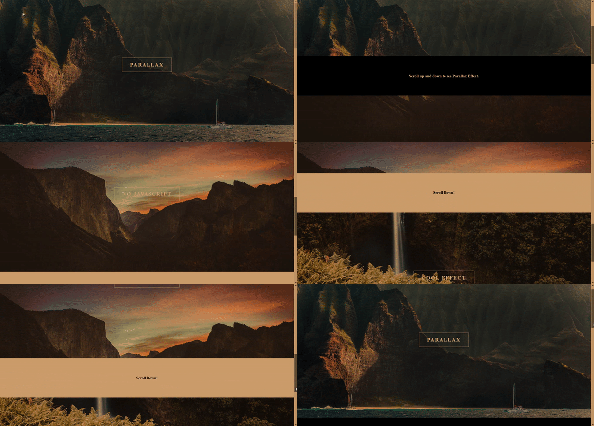
Smooth Parallax Scrolling Effect ( Pure CSS) | HTML And CSS
Before starting with the "Smooth Parallax Scrolling Effect Concept", it is very important to know the meaning of the word "parallax" so that we can understand the concept of parallax more deeply and we get a better idea of what we are going to make. The term “parallax” refers to the apparent movement of objects when viewed from different positions. You can visit these parallax scrolling websites. for better understanding.
Parallax scrolling is a special scrolling technique used in web design where the background images throughout a web page move slower than foreground images, creating an illusion of depth on a two-dimensional site.
In the world of website development, new ideas are constantly being created by web designers. However, some ideas become popular for a while and then fade away as technology advances. Among these ideas, only a few manage to provide both an excellent user interface and a great user experience. One such enduring concept is Parallax, which is still widely used by many popular websites because it offers both a fantastic user experience and a creative interface.
Read:Add Input Dynamically In Form | HTML, CSS And Javascript
Now the question is why we want to create a parallax effect and the answer from the visitor's perspective is that every visitor likes well maintained smooth, creative user interface and experience. From a website owner's perspective, any website owner wants more traffic on the website, for that, needs a cool user interface and intuitive user experience along with good content. So because of the smooth user experience and cool interface, web designers or website owners prefer the parallax effect websites. Parallax designs are very popular these days for website design and this concept was also very popular in the past few years. Here we are presenting the basic concept of parallax scrolling where the foreground is moving and the background is fixed.
Table Of Contents
Html
HTML5 document follows a specific sequence to show the content on the browser like body tag, head tag, etc. You wanna learn all the basics of html5 documents read the "introduction to html" article in detail. The reason to write the basic structure of an HTML document is that the browser can understand the document type and may start some processes or necessary actions. The basic html structure looks as below.
Html Structure
<!DOCTYPE html>
<html>
  <head>
    <title>Smooth Parallax Scrolling Effect | Rustcode</title>
    <style>
    </style>
  </head>
  <body>
    Content of the document.
    <script type="text/javascript"></script>
  </body>
</html>
Read Also:Simple Search Box Design | HTML And CSS
Html Code
We already wrote the code for the basic structure of html5, Now the document is ready to show the content on a webpage. Inside the body, content is visible to visitors while the head tag contains the metadata of the web page. We can write the required tags and content in the body tag, after that run this code on your browser and see the output. As we know that HTML only shows content in a basic format, it does not beautify that content. To beautify our content, we need css, which is inserted in this html document.
<body>

   <div id="bgbox1">
      <h1>PARALLAX</h1>
   </div>

   <center style="background:#000;">
      <h2 style="color: white;">Scroll up and down to see Parallax effect</h2>
   </center>

   <div id="bgbox2">
      <h1>NO JAVASCRIPT</h1>
   </div>

   <center style="background:#fff;">
      <h2 style="">SCROLL DOWN!</h2>
   </center>

   <div id="bgbox3">
      <h1>COOL EFFECT</h1>
   </div>

</body>
Read Also:
Css
The basic flow of content is already done. Now, it's time to beautify that content, so we will add css to html document. CSS can be added to the html document in three ways, here we are using the internal css method. We created three boxes with div tag in html and we added three images in these three boxes so that we can create a parallax effect. We used a background-image property of css to add images and there are other properties that you can see in the below css code. Apply the below css in html document and see the output on browser.
<style type="text/css">
* {
   padding: 0px;
   margin: 0px;
   box-sizing: border-box;
}

#bgbox1 {
   background-image: url(bg1.jpg);
}

#bgbox2 {
   background-image: url(bg2.jpg);
}

#bgbox3 {
   background-image: url(bg3.jpg);
}

#bgbox1,
#bgbox2,
#bgbox3 {
   width: 100%;
   height: 100vh;
   background-position: center;
   background-size: cover;
   background-attachment: fixed;
   background-repeat: no-repeat;
}

h1 {
   position: relative;
   top: 300px;
   left: 50%;
   transform: translate(-50%, -50%);
   font-size: 24px;
   letter-spacing: 3px;
   text-align: center;
   color: white;
   display: inline-flex;
   vertical-align: middle;
   background-color: black;
   padding: 18px 36px;
   border: 1px solid white;
   background-color: transparent;
}

h2 {
   padding: 80px;
   font-size: 18px;
}

</style>
We added three images in background bg1, bg2 and bg3. You can download these images from here.
Read Also:
Youtube Video
We already made one video using this code so that you can learn everything step by step. There are many video on our youtube channel so that you can learn each and every concept in depth.
Source Code
Below is the GitHub link so that you can download all this code from there. But we strongly recommend for beginners please do it yourself for shaping to web development skill.
Read Also:
- Snackbar Notification Animation | HTML, CSS And Javascript
- Simple Login Form Design | HTML And CSS
- Responsive Manual Image Slider | HTML, CSS And Javascript
- Grid Layout Responsive Design | HTML And CSS
- Cursor Animation With Hover Effect | HTML, CSS And GSAP
- Full Screen Overlay Responsive Navigation Bar | HTML, CSS And Javascript
- Glowing Neon Light Button Animation | HTML And CSS
- Image Zoom On Hover Animation Design | HTML And CSS
- Liquid Distortion Effect | HTML, CSS And Javascript


Comments
Post a Comment