Full Screen Overlay Responsive Navigation Bar Design Using GSAP | HTML ,CSS And GSAP
Yes, we will again develop a navigation bar with a different concept and 'GSAP' animations. We have designed many responsive navigations, you can see that 'Navigation Bar Playlist'. There we have also designed a navigation bar that also has a hover animation effect(navbar with hover line effect).
The 'Navigation Bar' is the kind of attraction for the user which takes our website experience to the next level. We have designed a number of website elements that will help create an attractive user interface, which you can see on our sitemap. Even e-commerce elements are available there.
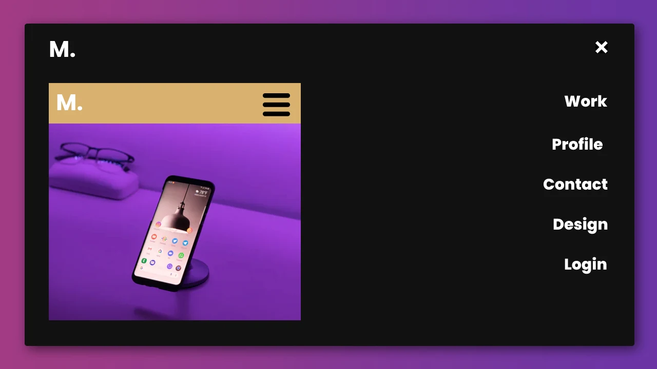
Let us talk about our main theme which is 'Responsive Navigation Bar Design using HTML, CSS and GSAP'. The navigation bar initially consists of a logo and a menu hamburger. When you click on the menu hamburger the navigation bar container moves from top to bottom, after that the links to the navigation bar appear on that container one by one and the menu hamburger icon replaces with a cross icon that allows you to close that navigation bar. The animation plays even when you close this navigation bar, let's discuss how it works. So when you click on the cross button all links from the container disappear one by one, after that the container will hide with bottom to top animation.
If you want to learn more animations using Gsap then you can visit this(gsap animation) playlist.
You can read interesting articles on web development. The link is given below.
01. html structure
First create an html file that contains HTML basic structure like this.
<!DOCTYPE html>
<html>
<head>
 <title>Full Screen Responsive Overlay Navigation Bar Design Using GSAP | Rustcode</title>
 <link rel="stylesheet" href="style.css">
</head>

<body>

  main content.

<script src="script.js"></script>
</body>
</html>
02. HTML
So now let's include the necessary plugins, which help us to create animations and icons.
'font-awesome'
<link rel="stylesheet" href="https://cdnjs.cloudflare.com/ajax/libs/font-awesome/5.15.3/css/all.min.css"/>
'gsap'
<script src="https://cdnjs.cloudflare.com/ajax/libs/gsap/3.6.1/gsap.min.js"></script>
Now it's time to include content into the HTML body that is visible to the user. You can see below the complete HTML code.
<!DOCTYPE html>
<html>
<head>
 <title>Full Screen Responsive Overlay Navigation Bar Design Using GSAP | Rustcode</title>
 <link rel="stylesheet" href="style.css">
<link rel="stylesheet" href="https://cdnjs.cloudflare.com/ajax/libs/font-awesome/5.15.3/css/all.min.css"/>
</head>

<body>

<div class="menu-container">
  <nav>
    <a href="#" class="menu-item">Work</a>
    <a href="#" class="menu-item">Profile</a>
    <a href="#" class="menu-item">Contact</a>
    <a href="#" class="menu-item">Design</a>
    <a href="#" class="menu-item">Login</a>
  </nav>
</div>

<header>
  <h1 class="logo">M.</h1>
  <i class="fa fa-bars menu-btn" id="menu-btn"></i>
</header>

<script src="https://cdnjs.cloudflare.com/ajax/libs/gsap/3.6.1/gsap.min.js"></script>
<script src="script.js"></script>
</body>
</html>
03. CSS
To beautify output we will use css. There are three main methods to include css in HTML documents. You can check out our article on this topic.
@import url('https://fonts.googleapis.com/css2?family=Poppins:wght@500;600;700');

body{
  overflow: hidden;
  margin: 0px;
  padding: 0px;
  background-color: #D5D5D5;
}

header{
  position: absolute;
  display: flex;
  align-items: center;
  width: 100%;
  justify-content: space-between;
  padding: 10px 24px;
  box-sizing: border-box;
  background: #111;
  color: white !important;
  font-family: "Poppins", sans-serif;
}

header .menu-btn{
  font-size: 26px;
  z-index: 10;
  cursor: pointer;
  padding: 20px;
}

.menu-container{
  position: absolute;
  width: 100vw;
  height: 100vh;
  background-color: #111;
  color: white !important;
  z-index: 9;
  display: flex;
  justify-content: flex-end;
  align-items: center;
  bottom: 100%;
}

.menu-container nav{
  display: flex;
  flex-direction: column;
  text-align: right;
  margin-right: 36px;
}

.menu-container nav > a{
  font-size: 2rem;
  color: #FFF;
  text-decoration: none;
  margin: 10px 0px;
  font-weight: 900;
  font-weight: lighter;
  font-family: "Poppins", sans-serif !important;
}

.menu-container nav > a:hover{
  text-decoration: underline;
}
04. GSAP SCRIPT
Gsap code to create animation. This is a very simple and basic animation code of 'GSAP'.
const menuContainer = document.querySelector(".menu-container");
const menu = document.querySelector("#menu-btn");
let status = false;

const menuAnimation = gsap.to(menuContainer, 2.2,{
  scaleX: 1,
  y: "100%",
  ease: Power4.easeInOut,
  paused: true
});

const link = gsap.from("nav > a", 2.2,{
  autoAlpha: 1,
  x:200,
  stagger: 0.6,
  ease: Power4.easeInOut,
  opacity: 0,
  delay: 3.5
});

menu.addEventListener("click", ({ target: {classList} }) =>{

  if (!status) {
    menuAnimation.play();
    TweenMax.delayedCall(1, function(){
      link.play();
      classList.remove("fa-bars");
      classList.add("fa-times");
    });
    status = !status;
  }
  else {
    link.reverse();
    TweenMax.delayedCall(3.8, function(){
      menuAnimation.reverse();
      classList.add("fa-bars");
      classList.remove("fa-times");
    });
    status = !status;
  }

});
05. Youtube Video
Here we are attaching a Youtube video from our channel so that you can understand this article better and you can create a better web user interface. We have a lot of videos on our Youtube channel which is related to the user interface and web development. You can also, learn about web development from there.
06. Source Code
After reading this article and watching a Youtube video, if you want to download the source code, you can download it from here and change this according to your need.
- RELATED POSTS:
- 01. Simple Blogging Template Design | HTML And CSS
- 02. Minimalist Navigation With Flash Effect | HTML And CSS
- 03. Profile Card Design | HTML And CSS
- 04. Responsive Side Navigation Bar Design | HTML, CSS And Javascript
- 05. Smooth Parallax Scrolling | HTML And CSS
- 06. Simple Search Box Design | HTML And CSS

Comments
Post a Comment