Page Loading Animation Using Html Css Only
When we visit a website, the first impression is often shaped by how seamlessly it loads. To enrich this experience, developers create engaging page-loading animations using nothing but HTML and CSS.
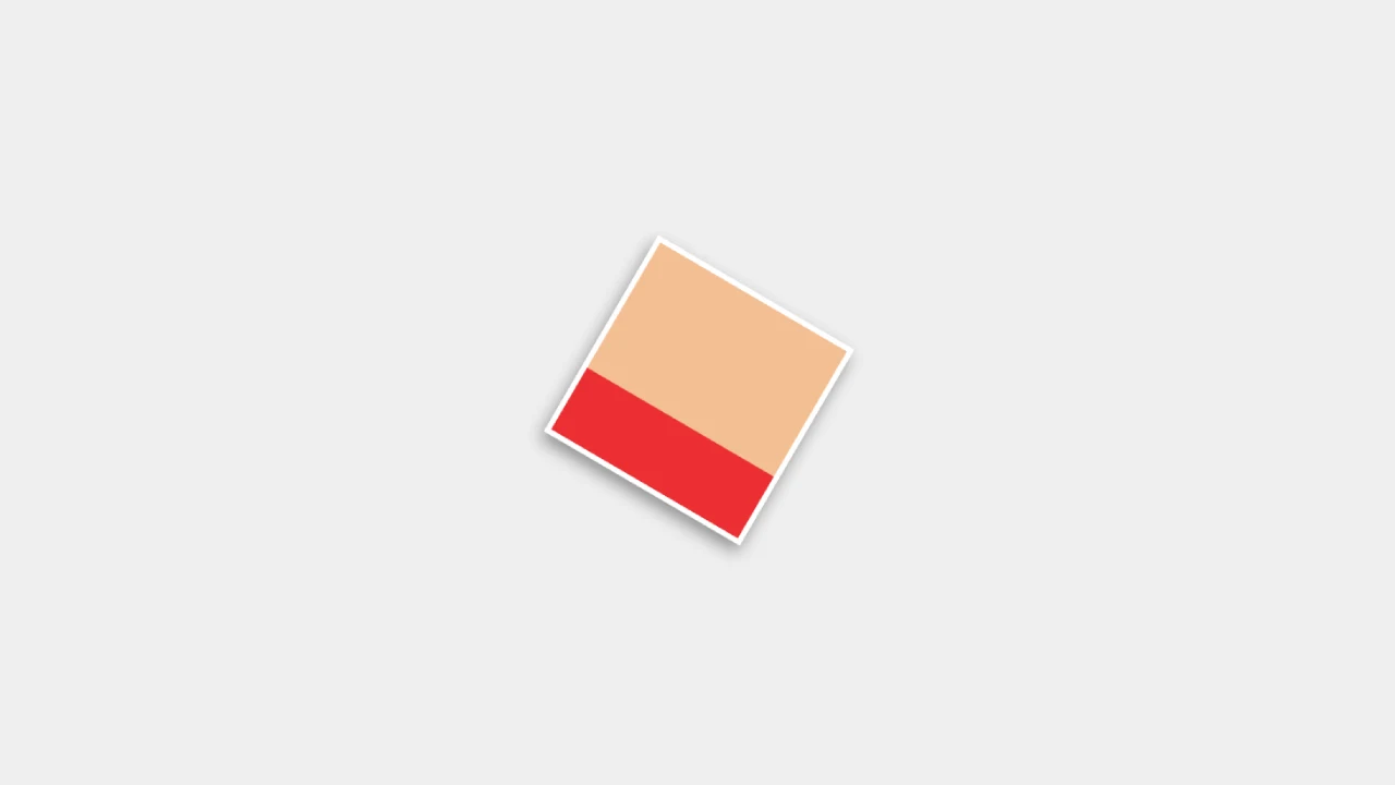
Imagine a loader where a simple square becomes a canvas of activity, morphing and shifting through layers and hues, signaling the page's imminent arrival. This lightweight approach to crafting loading indicators not only captivates the user but also ensures quick loading times and optimal performance across devices, especially for those with slower connections or on mobile platforms. Such animations are not just functional; they add a touch of elegance to the wait, making the anticipation of the website's content part of the overall experience.
Table Of Contents
Read Also:
HTML:
Let's begin with the foundational structure of an HTML document, as depicted below.
<!DOCTYPE html>
<html>
 <head>
   <title>Page Loading Animation Using Html Css Only</title>
 </head>
 <body>
	// Content
 </body>
</html>
Now that we have established the basic HTML structure and ensured that all necessary dependencies are included in the HTML document, it is time to proceed with writing the HTML code, which is provided below.
<!DOCTYPE html>
<html>
<head>
  <title>Page Loading Animation Using Html Css Only | Rustcode</title>
  <link rel="stylesheet" href="style.css">
</head>
<body>

<div class="container">
  <div class="square"></div>
  <div class="square"></div>
  <div class="square"></div>
  <div class="square"></div>
</div>

</body>
</html>
- <!DOCTYPE html>: This declaration defines the document type and version of HTML being used, in this case, HTML5.
- <html>: This is the root element of an HTML page.
- <head>: Contains meta-information about the document, such as its title and links to CSS files.
- <title>: Specifies the title of the webpage, which appears in the browser's title bar or tab. Here, it is set to "Page Loading Animation Using Html Css Only | Rustcode".
- <link>: Links to an external CSS file that defines the styles for the page, named "style.css". This likely contains the styling for the page loading animation.
- <body>: Contains the content of the HTML document.
- <div class="container">: Defines a division or a section in the document, which is used as a container to hold other elements. Here, it likely serves as the parent container for the squares that will animate.
- <div class="square"></div>: These are individual div elements with a class of "square". There are four of these elements, which suggests they will be styled using CSS to create a square shape, and they will be part of the loading animation.
Read Also:
- Announcement Popup Box Using PopboxJs | Rustcode
- Cursor Animation With Hover Effect Using GSAP | HTML, CSS And GSAP
- Custom Mouse Cursor Javascript | HTML, CSS And PointerJs
- Html Elements Smooth Drag And Drop Animation | HTML, CSS And Sortable
- Particle Background Animation | HTML, CSS And ParticleJs
- Responsive Portfolio Landing Page | HTML, CSS, jQuery And GSAP
- Two Image Slider | HTML, CSS And JsPlugin
CSS:
*{
  margin: 0px;
  padding: 0px;
}

html, body{
  background: #EFEFEF;
}

.container{
  width: 80px;
  height: 80px;
  position: absolute;
  top: 50%;
  left: 50%;
  transform: translate(-50%, -50%);
  border: 2px solid white;
  background: #F5BF94;
  box-shadow: 0px 3px 6px rgba(0, 0, 0, 0.4);
}

.square{
  position: absolute;
  top: 0;
  left: 0;
  bottom: 0;
  right: 0;
}

.square:nth-child(1){
  background: #EB2F33;
  transform: scaleY(0);
  transform-origin: center bottom;
  animation: square1 3s linear infinite;
}

.square:nth-child(2){
  background: #F5B847;
  transform: scaleY(0);
  transform-origin: left center;
  animation: square2 3s linear infinite;
}

.square:nth-child(3){
  background: #01C6C5;
  transform: scaleY(0);
  transform-origin: center top;
  animation: square3 3s linear infinite;
}

.square:nth-child(4){
  background: #1C7872;
  transform: scaleY(0);
  transform-origin: right center;
  animation: square4 3s linear infinite;
}

@keyframes square1 {
  0%{transform: scaleY(0);}
  25%{transform: scaleY(1);}
  50%{transform: scaleY(1);}
  100%{transform: scaleY(0);}
}

@keyframes square2 {
  0%{transform: scaleY(0);}
  25%{transform: scaleY(0);}
  50%{transform: scaleY(1);}
  75%{transform: scaleY(1);}
  100%{transform: scaleY(0);}
}

@keyframes square3 {
  0%{transform: scaleY(0);}
  50%{transform: scaleY(0);}
  75%{transform: scaleY(1);}
  100%{transform: scaleY(1);}
}

@keyframes square4 {
  0%{transform: scaleY(0);}
  50%{transform: scaleY(0);}
  75%{transform: scaleY(0);}
  100%{transform: scaleY(1);}
}
- The * selector removes default margins and padding from all elements.
- The html, body selector sets the background color for the whole page.
- .container is styled to be a small, centered box with a border, background color, and shadow for a 3D look.
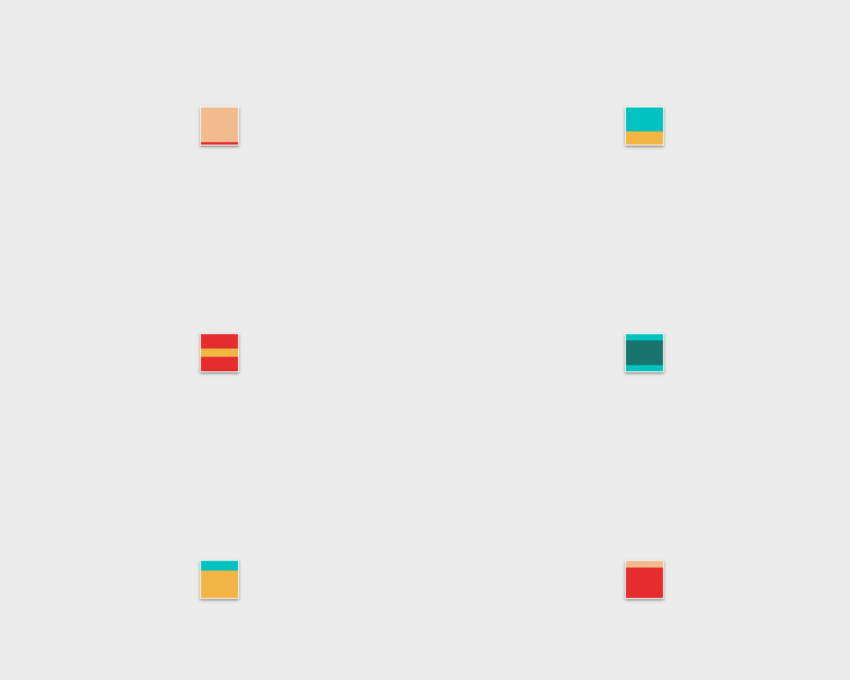
- Each .square is targeted with the :nth-child selector to receive individual background colors and initial states that make them invisible (scaled down to zero). The transform-origin sets the point around which they will animate.
- The @keyframes animations (square1 to square4) define how each square will scale up and down in a 3-second loop. Each square animates at a different interval, creating a rhythmic pattern of movement within the container, serving as a loading animation.
Read Also:
Read Also:
Youtube Video:
We also made a youtube video for "Page Loading Animation Using Html Css Only", if you want to watch demo you can click on below video.
Read Also:
- Bookmark Interaction Animation | Html Css And Gsap
- Cursor Animation With Hover Effect Using GSAP | HTML, CSS And GSAP
- Full Screen Responsive Navbar Design | HTML, CSS And GSAP
- Gaming CPU Landing Page Design Using GSAP | HTML, CSS And GSAP
- Page Loading With Intro Using GSAP | HTML, CSS And GSAP
- Page Transition Animation Using GSAP | HTML, CSS And GSAP
- Responsive Portfolio Landing Page | HTML, CSS, jQuery And GSAP
- Website Loader Animation Using GSAP | HTML, CSS And GSAP


Comments
Post a Comment