Responsive Card With Hover Interactions Using Css Only
We all want our websites and apps to be engaging and enjoyable for users. One effective way to achieve this is by creating "responsive" design, a user-friendly, clean design with some cool animation. The exciting part is that we can achieve all this by jus using html and css only(without the need for complex JavaScript).
Responsive cards are like neat containers that display various types of content, such as articles or images. They become interactive and eye-catching when you move your mouse over them, with effects like changing colors or subtle movements. Moreover, these cards adapt effortlessly to different devices, like mobile phones, ensuring accessibility and a seamless user experience.
In this article, we'll guide you through the process of creating these captivating responsive cards with hover interactions using CSS. When you hover over a card, it will reveal details about it and provide a button to explore further. Regardless of your coding expertise, you'll easily follow the step-by-step instructions, empowering you to make your web projects more engaging and user-friendly—whether on a computer, tablet, or smartphone. Let's embark on the journey into the world of CSS-based responsive cards with hover effects!
Table Of Contents
Read Also:
HTML:
Let's begin with the foundational structure of an HTML document, as depicted below.
<!DOCTYPE html>
<html>
 <head>
   <title>Responsive Card With Hover Interactions Using Css Only</title>
 </head>
 <body>
	// Content
 </body>
</html>
Now that we have established the basic HTML structure and ensured that all necessary dependencies are included in the HTML document, it is time to proceed with writing the HTML code, which is provided below.
<!DOCTYPE html>
<html>
<head>
  <title>Responsive Card With Hover Interactions Using Css Only | Rustcode</title>
  <link rel="stylesheet" href="style.css">
  <link rel="stylesheet" href="font.css">
</head>
<body>

<div class="page-content">
  <div class="card">
    <div class="content">
      <h2 class="title">Mountain</h2>
      <p class="description">Check out all of these gorgeous mountain trips</p>
      <button class="btn">Explore</button>
    </div>
  </div>
  <div class="card">
    <div class="content">
      <h2 class="title">Beach</h2>
      <p class="description">Plan your next beach trip with these fabulous destinations</p>
      <button class="btn">Explore</button>
    </div>
  </div>
  <div class="card">
    <div class="content">
      <h2 class="title">Desert</h2>
      <p class="description">It's the desert you've always dreamed of</p>
      <button class="btn">Explore</button>
    </div>
  </div>
  <div class="card">
    <div class="content">
      <h2 class="title">Forest</h2>
      <p class="description">Seriously, straight up, just blast off into outer space today</p>
      <button class="btn">Explore</button>
    </div>
  </div>
</div>

</body>
</html>
- The HTML document defines a webpage.
- It has a title, "Responsive Card With Hover Interactions Using CSS Only | Rustcode.".
- The webpage links to two external CSS files: "style.css" and "font.css" for styling.
- Inside the <body> element, there's a container with the class "page-content."
- Inside the container, there are four cards, each represented by a <div> with class "card".
- Each card has a content section, represented by a <div> with the class "content."
- Inside the content section, there's an <h2> element for the card's title.
- Below the title, there's a <p> element for a short description of the destination.
- Each card includes a button with the class "btn" labeled "Explore".
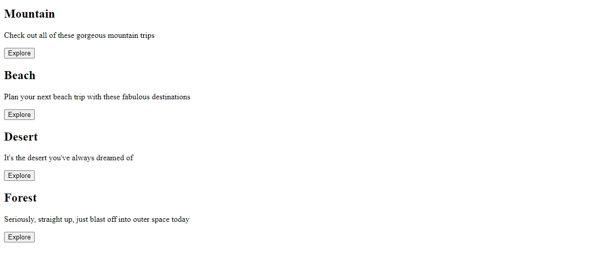
Output:
Read Also:
- Announcement Popup Box Using PopboxJs | Rustcode
- Cursor Animation With Hover Effect Using GSAP | HTML, CSS And GSAP
- Custom Mouse Cursor Javascript | HTML, CSS And PointerJs
- Html Elements Smooth Drag And Drop Animation | HTML, CSS And Sortable
- Particle Background Animation | HTML, CSS And ParticleJs
- Responsive Portfolio Landing Page | HTML, CSS, jQuery And GSAP
- Two Image Slider | HTML, CSS And JsPlugin
CSS:
:root {
  --d: 700ms;
  --e: cubic-bezier(0.19, 1, 0.22, 1);
}

* {
  border: 0;
  margin: 0;
  padding: 0;
  box-sizing: border-box;
  font-family: "Neue Metana";
}

html, body {
  height: 100%;
  display: grid;
  place-items: center;
  background: #E5E5E5;
}

.page-content {
  display: grid;
  grid-gap: 1rem;
  padding: 1rem;
  max-width: 1024px;
  margin: 0 auto;
  font-family: "Neue Metana";
}

.card {
  position: relative;
  display: flex;
  align-items: flex-end;
  overflow: hidden;
  padding: 1rem;
  width: 100%;
  text-align: center;
  color: whitesmoke;
  background-color: whitesmoke;
  cursor: pointer;
  border-radius: 6px;
  box-shadow: 0 1px 1px rgba(0, 0, 0, 0.1), 0 2px 2px rgba(0, 0, 0, 0.1), 0 4px 4px rgba(0, 0, 0, 0.1), 0 8px 8px rgba(0, 0, 0, 0.1), 0 16px 16px rgba(0, 0, 0, 0.1);
}

.card:before {
  content: "";
  position: absolute;
  top: 0;
  left: 0;
  width: 100%;
  height: 110%;
  pointer-events: none;
  background-size: cover;
  background-position: 0 0;
  transition: transform calc(var(--d) * 1.5) var(--e);
}

.card:after {
  content: "";
  display: block;
  position: absolute;
  top: 0;
  left: 0;
  width: 100%;
  height: 200%;
  pointer-events: none;
  transform: translateY(-50%);
  transition: transform calc(var(--d) * 2) var(--e);
}

.card:nth-child(1):before {
  background-image: url(bg01.jpg);
}

.card:nth-child(2):before {
  background-image: url(bg02.jpg);
}

.card:nth-child(3):before {
  background-image: url(bg03.jpg);
}

.card:nth-child(4):before {
  background-image: url(bg04.jpg);
}

.content {
  position: relative;
  display: flex;
  flex-direction: column;
  align-items: center;
  width: 100%;
  padding: 1rem;
  transition: transform var(--d) var(--e);
  z-index: 1;
}

.content > * + * {
  margin-top: 1rem;
}

.title {
  font-size: 1.3rem;
  font-weight: bold;
  letter-spacing: 2px;
  line-height: 1.2;
}

.description {
  font-family: "Neue Metana";
  letter-spacing: 1px;
  font-size: 10px;
  line-height: 1.4;
}

.btn {
  cursor: pointer;
  margin-top: 1.5rem;
  padding: 0.75rem 1.5rem;
  font-size: 0.65rem;
  font-weight: bold;
  letter-spacing: 1px;
  color: black;
  background-color: white;
  border: none;
}

.btn:hover {
  background-color: #E5E5E5;
}

.btn:focus {
  outline: 1px dashed white;
  outline-offset: 3px;
}

@media (hover: hover) and (min-width: 600px)  {
  .page-content {
    grid-template-columns: repeat(2, 1fr);
    }

  .card {
    height: 350px;
  }

  .card:after {
    transform: translateY(0);
  }

  .content {
    transform: translateY(calc(100% - 4.5rem));
  }

  .content > *:not(.title) {
    opacity: 0;
      transform: translateY(1rem);
      transition: transform var(--d) var(--e), opacity var(--d) var(--e);
  }

  .card:hover,
  .card:focus-within {
    align-items: center;
  }

  .card:hover:before,
  .card:focus-within:before {
    transform: translateY(-4%);
  }

  .card:hover .content,
  .card:focus-within .content {
    transform: translateY(0);
  }

  .card:hover .content > *:not(.title),
  .card:focus-within .content > *:not(.title)  {
    opacity: 1;
      transform: translateY(0);
      transition-delay: calc(var(--d) / 8);
  }

  .card:focus-within:before,
  .card:focus-within:after,
  .card:focus-within .content,
  .card:focus-within .content > *:not(.title) {
    transition-duration: 0s;
  }
}

@media (min-width: 800px) {
  .page-content {
       grid-template-columns: repeat(4, 1fr);
  }
}
-
The ":root" section sets some global variables for animation timing and easing.
-
The "*" selector applies styles to all elements, resetting margins, padding, and setting the font.
-
The "html" and "body" elements are styled to center content on the page with a background color.
-
".page-content" styles a container for the cards with padding and maximum width.
-
".card" styles the individual cards with positioning, shadow, and a hover effect.
-
":before" and ":after" pseudo-elements create background animations for the cards.
-
".content" styles the content inside the cards, arranging them in a column.
-
".btn" styles the "Explore" button with hover and focus effects.
-
Media queries adjust the layout and animations for different screen sizes.
-
The code handles hover interactions, including animations and transitions, to make the cards visually engaging and responsive to user actions.
Read Also:
Read Also:
Youtube Video:
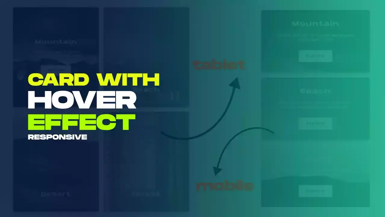
We also made a youtube video for "Responsive Card With Hover Interactions Using Css Only", if you want to watch demo you can click on below video.
Read Also:
- Bookmark Interaction Animation | Html Css And Gsap
- Cursor Animation With Hover Effect Using GSAP | HTML, CSS And GSAP
- Full Screen Responsive Navbar Design | HTML, CSS And GSAP
- Gaming CPU Landing Page Design Using GSAP | HTML, CSS And GSAP
- Page Loading With Intro Using GSAP | HTML, CSS And GSAP
- Page Transition Animation Using GSAP | HTML, CSS And GSAP
- Responsive Portfolio Landing Page | HTML, CSS, jQuery And GSAP
- Website Loader Animation Using GSAP | HTML, CSS And GSAP


Comments
Post a Comment