Next Page Button Design With Hover Effect Using Html Css Only
Making websites interesting is fun! In this article, we'll learn how to create a special "Next Page Button" that does something cool when you move your mouse over it. We'll use simple codes called HTML and CSS. Plus, we'll use a special type of picture called SVG to make it even more interesting.
SVG pictures are great for the web because they look good no matter how big or small your screen is. We'll start by creating a basic button with SVG (next icon), and then we'll make it look nice with css. The best part is when you move your mouse over the button, it will do something fun! We can do this with CSS, and it will make your website more engaging for people who visit it.
By using SVG, we can make our button look really cool with smooth animations and special effects. Whether you're new to web design or you already know a lot, this tutorial will help you make your websites more exciting. Let's get started and make a fantastic "Next Page Button" together!
Table Of Contents
Read Also:
HTML:
Let's begin with the foundational structure of an HTML document, as depicted below.
<!DOCTYPE html>
<html>
 <head>
   <title>Next Button Design With Hover Effect Using Html Css Only</title>
 </head>
 <body>
	// Content
 </body>
</html>
Now that we have established the basic HTML structure and ensured that all necessary dependencies are included in the HTML document, it is time to proceed with writing the HTML code, which is provided below.
<!DOCTYPE html>
<html>
<head>
<title>Next Page Button Design With Hover Effect | Rustcode</title>
<link rel="stylesheet" href="font.css">
<link rel="stylesheet" href="style.css">
</head>
<body>

<button>
  <span>Next Page</span>
  <svg width="34" height="34" viewBox="0 0 74 74" fill="none" xmlns="http://www.w3.org/2000/svg">
    <circle cx="37" cy="37" r="35.5" stroke="white" stroke-width="3"></circle>
    <path d="M25 35.5C24.1716 35.5 23.5 36.1716 23.5 37C23.5 37.8284 24.1716 38.5 25 38.5V35.5ZM49.0607 38.0607C49.6464 37.4749 49.6464 36.5251 49.0607 35.9393L39.5147 26.3934C38.9289 25.8076 37.9792 25.8076 37.3934 26.3934C36.8076 26.9792 36.8076 27.9289 37.3934 28.5147L45.8787 37L37.3934 45.4853C36.8076 46.0711 36.8076 47.0208 37.3934 47.6066C37.9792 48.1924 38.9289 48.1924 39.5147 47.6066L49.0607 38.0607ZM25 38.5L48 38.5V35.5L25 35.5V38.5Z" fill="white"></path>
</svg>
</button>

</body>
</html>
-
It starts with the <!DOCTYPE html> declaration, which tells the browser that this is an HTML5 document.
-
The page's title is set to "Next Page Button Design With Hover Effect | Rustcode" using the <title> element in the <head> section.
-
Two external style sheets, "font.css" and "style.css," are linked to the page to apply additional styles to the content.
-
In the <body> section, there is a <button> element representing the "Next Page" button.
-
Inside the button, there is a <span> element containing the text "Next Page." This is the visible text on the button.
-
Next, there is an <svg> element that defines a scalable vector graphic. It creates a circular border around the button with a white circle and an arrow inside it.
-
The <circle> element creates the white circle with specific attributes like its position, size, and color.
-
The <path> element defines the arrow inside the circle. It specifies the path the arrow takes using a series of points and curves.
-
The fill="white" attribute in both the <circle> and <path> elements sets the fill color to white.
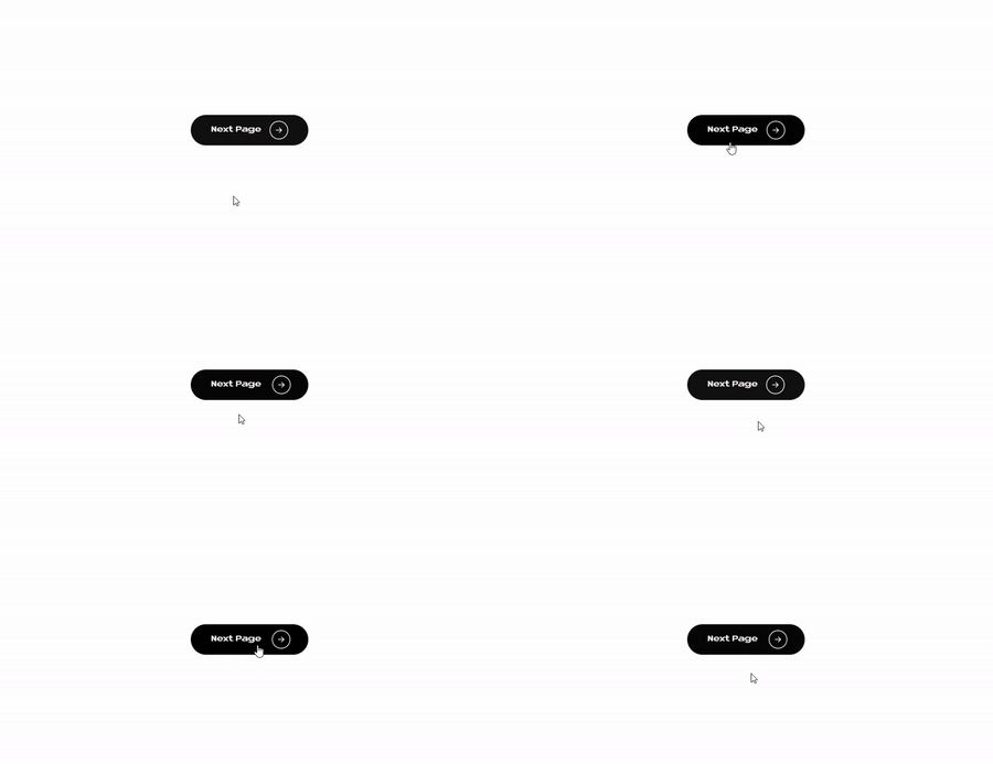
Output:
Read Also:
- Announcement Popup Box Using PopboxJs | Rustcode
- Cursor Animation With Hover Effect Using GSAP | HTML, CSS And GSAP
- Custom Mouse Cursor Javascript | HTML, CSS And PointerJs
- Html Elements Smooth Drag And Drop Animation | HTML, CSS And Sortable
- Particle Background Animation | HTML, CSS And ParticleJs
- Responsive Portfolio Landing Page | HTML, CSS, jQuery And GSAP
- Two Image Slider | HTML, CSS And JsPlugin
CSS:
*{
 margin: 0px;
 padding: 0px;
 box-sizing: border-box;
}

body{
  background-color: #F5F5F5;
}

body{
  display: flex;
  flex-direction: column;
  align-items: center;
  justify-content: center;
  height: 100vh;
  width: 100vw;
}
button {
  cursor: pointer;
  font-weight: 700;
  font-family: "Neue Metana", sans-serif;
  padding: 10px 36px;
  border-radius: 100px;
  background-color: #111;
  border: 1px solid transparent;
  display: flex;
  align-items: center;
  font-size: 14px;
  color: white;
  transition: all .2s;
}

button:hover {
  background: #000;
}

button > svg {
  width: 34px;
  margin-left: 16px;
  transition: transform .3s ease-in-out;
}

button:hover svg {
  transform: translateX(5px);
}

button:active {
  transform: scale(0.95);
}
-
* is a wildcard selector that applies the following styles to all elements on the page. It sets the margins and padding to 0 pixels and uses box-sizing: border-box to make sure the element's total width and height include both the content and padding, but not the margin.
-
body is used to style the background of the webpage. It sets the background color to a light gray (#F5F5F5).
-
The second body selector is used to style the main content of the page. It turns the body into a flex container with a column layout, aligns items (content) to the center horizontally and vertically, and sets the height and width to 100% of the viewport's height and width.
-
button styles are applied to all button elements on the page. It sets the cursor to a pointer (usually a hand symbol when hovering over the button), adjusts the font weight and family, sets padding for the button, rounds the corners (border-radius), defines a background color, and specifies that the button should have no visible border. The button text is colored white, and there's a smooth transition effect for all style changes that take 0.2 seconds.
-
button:hover styles are applied when the mouse hovers over the button. It changes the background color to black (#000), creating a visual feedback effect.
-
button > svg styles apply to SVG (Scalable Vector Graphics) elements that are children of the button. It sets the width and adds a margin to the left side of the SVG. There's also a smooth transition effect when the SVG is transformed.
-
button:hover svg styles are applied when the mouse hovers over the button, causing the SVG to move 5 pixels to the right.
-
button:active styles apply when the button is clicked (active state). It scales the button down to 95% of its original size, creating a brief visual effect when the button is pressed.
Read Also:
Read Also:
Youtube Video:
We also made a youtube video for "Next Page Button Design With Hover Effect Using Html Css Only", if you want to watch demo you can click on below video.
Read Also:
- Bookmark Interaction Animation | Html Css And Gsap
- Cursor Animation With Hover Effect Using GSAP | HTML, CSS And GSAP
- Full Screen Responsive Navbar Design | HTML, CSS And GSAP
- Gaming CPU Landing Page Design Using GSAP | HTML, CSS And GSAP
- Page Loading With Intro Using GSAP | HTML, CSS And GSAP
- Page Transition Animation Using GSAP | HTML, CSS And GSAP
- Responsive Portfolio Landing Page | HTML, CSS, jQuery And GSAP
- Website Loader Animation Using GSAP | HTML, CSS And GSAP


Comments
Post a Comment