Create Animated Underline Links On Hover Using Html Css Only
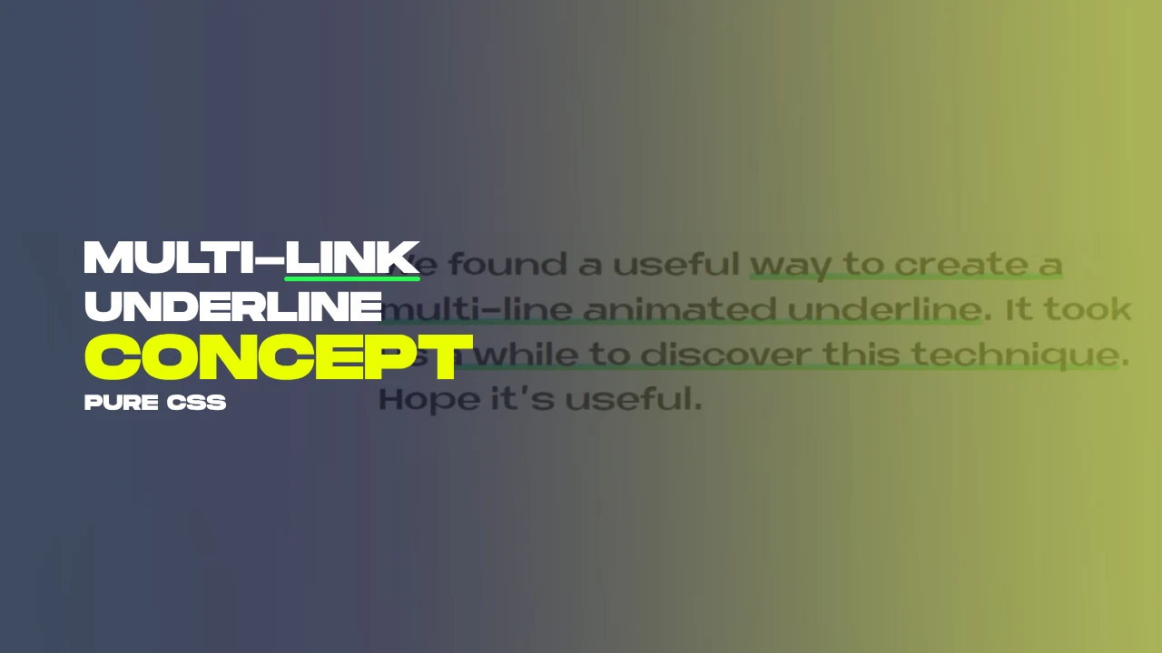
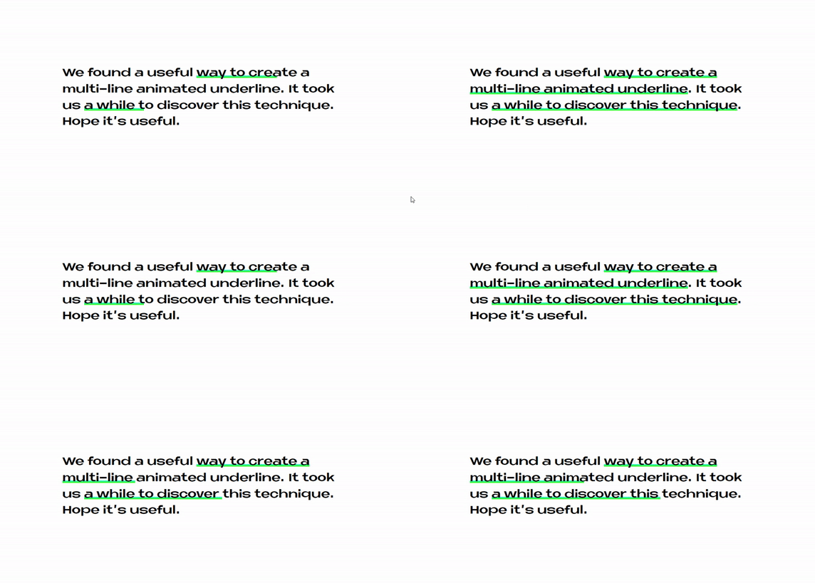
Creating animated underlines for links when you hover your mouse over them using only HTML and CSS is a fun way to make your website more interesting. It adds a cool animation to links that makes them look fancy and more user-friendly. This effect is specially designed for multi-line text, so the hover effect works smoothly even when your links span multiple lines.
You can do this without any fancy coding, just using the basic tools(html css only) that web designers and developers use. This article will show you how to do it step by step, and you'll be able to make your website's links look more exciting in no time.
Table Of Contents
Read Also:
HTML:
Let's begin with the foundational structure of an HTML document, as depicted below.
<!DOCTYPE html>
<html>
 <head>
   <title>Create Animated Underline Links On Hover Using Html Css Only</title>
 </head>
 <body>
	// Content
 </body>
</html>
Now that we have established the basic HTML structure and ensured that all necessary dependencies are included in the HTML document, it is time to proceed with writing the HTML code, which is provided below.
<!DOCTYPE html>
<html>
<head>
<title>Create Multi-line Animated Underline | Rustcode</title>
<link rel="stylesheet" href="font.css">
<link rel="stylesheet" href="style.css">
</head>
<body>

  <h2>We found a useful <a href="#">way to create a multi-line animated underline</a>. It took us <a href="#">a while to discover this technique</a>. Hope it's useful.</h2>


</body>
</html>
- This is a basic HTML webpage.
- It uses two external style sheets, "font.css" and "style.css" to control its appearance.
- The page has a heading (h2) with two sentences, and each sentence contains a clickable link.
- The links have "#" as their URL, so they don't lead to any specific webpage.
Read Also:
- Announcement Popup Box Using PopboxJs | Rustcode
- Cursor Animation With Hover Effect Using GSAP | HTML, CSS And GSAP
- Custom Mouse Cursor Javascript | HTML, CSS And PointerJs
- Html Elements Smooth Drag And Drop Animation | HTML, CSS And Sortable
- Particle Background Animation | HTML, CSS And ParticleJs
- Responsive Portfolio Landing Page | HTML, CSS, jQuery And GSAP
- Two Image Slider | HTML, CSS And JsPlugin
CSS:
* {
  margin: 0px;
  padding: 0px;
  box-sizing: border-box;
}

body {
  display: flex;
  flex-direction: column;
  align-items: center;
  justify-content: center;
  height: 100vh;
  width: 100vw;
  color: #000;
  font-family: "Neue Metana", sans-serif;
  font-size: 130%;
}

h2 {
  line-height: 1.5;
  max-width: 800px;
  margin: 0 auto;
  font-weight: 600;
  animation: h2Animation 0.5s ease-out;
}

a {
  display: inline;
  text-decoration: none;
  color: inherit;
  background: linear-gradient(transparent 70%, #3ed 70%, #3f1 90%, transparent 90%, transparent 100%);
  background-repeat: no-repeat;
  background-size: 0% 100%;
  animation: linkAnimation 1s cubic-bezier(0.645, 0.045, 0.355, 1) 0.5s forwards;
  Animation-delay: 0.75s;
  cursor: pointer;
}

a:active {
  color: rgba(0, 0, 0, 0.5);
}

@keyframes linkAnimation {
  to {
    background-size: 100% 100%;
  }
}

@keyframes h2Animation {
  0% {
    opacity: 0;
    transform: translateY(80px);
    line-height: 2;
  }
  50% {
    opacity: 0;
  }
  100% {
    opacity: 1;
    transform: translateY(0px);
    line-height: 1.5;
  }
}
Global Styles:
- Resets margins, padding, and box-sizing for all elements to establish a consistent baseline.
Body Styles:
- Centers the content both vertically and horizontally on the page using Flexbox.
- Sets the background color to white (#000).
- Chooses the font family "Neue Metana" and increases the font size to 130%.
Heading Styles (h2):
- Adjusts line-height to 1.5 for better spacing between lines of text.
- Limits the maximum width of the heading to 800 pixels and centers it on the page.
- Increases the font weight to 600 for a bolder look.
- Applies the "h2Animation" to create an animation for the heading.
Link Styles (a):
- Makes links display inline and removes underlines, maintaining the text color.
- Applies a linear gradient as a background, creating an animated underline when hovered.
- Utilizes the "linkAnimation" to animate the background-size property for the underline effect.
- Adds a delay to the link animation (0.5 seconds) to control the timing of the animation.
- Changes the cursor to a pointer when hovering over links for a click indication.
Active Link Styles (a:active):
- Darkens the text color slightly when a link is clicked.
Keyframe Animations:
- Defines the "linkAnimation" keyframe to gradually increase the background-size to create the underline effect when links are hovered.
- Defines the "h2Animation" keyframe, which begins with lower opacity and a slight downward movement, then gradually becomes fully visible and centered.
Read Also:
Read Also:
Youtube Video:
We also made a youtube video for "Create Animated Underline Links On Hover Using Html Css Only", if you want to watch demo you can click on below video.
Read Also:
- Bookmark Interaction Animation | Html Css And Gsap
- Cursor Animation With Hover Effect Using GSAP | HTML, CSS And GSAP
- Full Screen Responsive Navbar Design | HTML, CSS And GSAP
- Gaming CPU Landing Page Design Using GSAP | HTML, CSS And GSAP
- Page Loading With Intro Using GSAP | HTML, CSS And GSAP
- Page Transition Animation Using GSAP | HTML, CSS And GSAP
- Responsive Portfolio Landing Page | HTML, CSS, jQuery And GSAP
- Website Loader Animation Using GSAP | HTML, CSS And GSAP


Comments
Post a Comment