Tooltip Text Animation Using Html Css Only
In a website's design, there are lots of small elements used to make the front end look better and one of these elements is called a tooltip. A CSS tooltip is like a tiny pop-up box with text that appears when you move mouse over something on a webpage.
Tooltips are handy because they can give you extra information or context about whatever you're looking at. If you want to make these tooltips fancier, you can use CSS to make the text inside them animate. This means the text can move or change in some cool way when you hover your mouse over it.
Creating an animated tooltip involves using both HTML tags (to structure and write the tooltip content) and CSS styles (to make it look good and add animations). The animations happen when you hover mouse over the tooltip-triggering element. You can customize how these animations behave, like how long they last, their timing, and how many times they repeat. It's also worth mentioning that you can create tooltips with similar effects using JavaScript.
For additional web animations, you can check out button playlist. If you're interested in web development, you can explore a variety of insightful articles by clicking on this link. These articles cover various aspects of web development and can help you gain a better understanding of the web development topic.
Table Of Contents
Read Also:
HTML:
Before we get into writing code, we have to set up a simple framework for our HTML document. This helps the web browser recognize the type of document it's dealing with and prepares it to do some initial work. The fundamental structure of an HTML document looks like this:
Html Structure
 <!DOCTYPE html>
<html>
<head>
  <title>Document Title</title>
  <link rel="stylesheet" href="style.css">
</head>

<body>

 Content of the document.

</body>
</html>
-
<!DOCTYPE html>: This declaration tells the browser that the document is written in HTML5. -
<html>: The root element of the document, which contains all other HTML elements. -
<head>: This section contains meta-information about the document, such as the title (displayed in the browser's title bar) and references to external resources like stylesheets. -
<title>: Sets the title of the webpage, which appears in the browser's title bar or tab. -
<link rel="stylesheet" href="style.css">: This line links an external stylesheet named "style.css" to the HTML document. It's used to apply styles (like fonts and colors) to the webpage's content. -
<body>: This section contains the main content of the webpage, which is displayed in the browser's main window. In this case, it simply has the text "Content of the document".
After you've created the basic structure of your HTML webpage, it's time to add the essential HTML tags and content. Once that's done, you can open this code in your web browser to see what it looks like. However, HTML on its own presents content in a simple, unstyled manner.
To make your content more visually appealing, you should use CSS (Cascading Style Sheets). CSS can be added to your HTML document to create an attractive user interface. In this case, we're going to use CSS to make an animation look appealing. There are three methods for including CSS in an HTML document, and you can find more details in this article.
Html Code
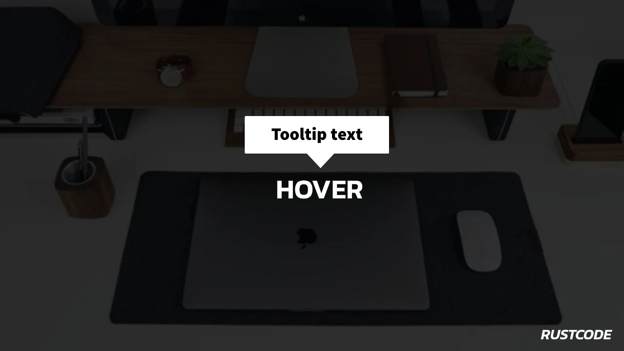
<body>
  <div class="container">Hover
    <span>Tooltip text</span>
  </div>
</body>
This HTML code creates a webpage with a container div element. When you hover your mouse over the "Hover" text inside the div, a tooltip with the text "Tooltip text" will appear.
Output:
Hover Tooltip text
Read Also:
- Announcement Popup Box Using PopboxJs | Rustcode
- Cursor Animation With Hover Effect Using GSAP | HTML, CSS And GSAP
- Custom Mouse Cursor Javascript | HTML, CSS And PointerJs
- Html Elements Smooth Drag And Drop Animation | HTML, CSS And Sortable
- Particle Background Animation | HTML, CSS And ParticleJs
- Responsive Portfolio Landing Page | HTML, CSS, jQuery And GSAP
- Two Image Slider | HTML, CSS And JsPlugin
CSS:
Now, let's make our HTML content look better by adding some CSS to our HTML file. There are three ways to add CSS to an HTML document, and in this example, we'll use the internal CSS method. Simply write the CSS code provided below and see how it affects the appearance of your webpage when you view it in your web browser.
body {
  font-family: sans-serif;
  background-color: #000;
  color: white;
}

.container {
  position: absolute;
  top: 50%;
  left: 50%;
  transform: translate(-50%, -50%);
  font-size: 20px;
  display: inline-block;
  cursor: default;
  border-bottom: 1px solid white;
}

.container span {
  position: absolute;
  width: 120px;
  bottom: 125%;
  left: 50%;
  background: white;
  color: black;
  text-align: center;
  padding: 5px 0px;
  margin-left: -60px;
  border-radius: 6px;
  visibility: hidden;
  opacity: 0;
  transition: opacity .5s;
}

.container span::after {
  content: "";
  position: absolute;
  top: 100%;
  left: 50%;
  margin-left: -5px;
  border-width: 5px;
  border-style: solid;
  border-color: white transparent transparent transparent;
}

.container:hover span {
  visibility: visible;
  opacity: 1;
}
-
body: This sets the style for the entire webpage body. It specifies the font family, background color (black), and text color (white). -
.container: This defines the style for a container element. It positions the container in the center of the page (both horizontally and vertically), sets the font size, displays it as an inline block, adds a default cursor, and gives it a white bottom border. -
.container span: This styles a child element of the container. It positions a small white box with black text below the container. Thevisibilityandopacityproperties are initially set to hide it, and a transition effect is added to gradually show it. -
.container span::after: This pseudo-element styles a small triangle that appears below the white box. It's used for decoration. -
.container:hover span: This rule defines the style for the white box when the container is hovered over. It makes the white box visible and fully opaque, showing the tooltip-like information.
Read Also:
- 07+ Best Free Blogging Platform To Make Money
- 07+ Best Google Fonts Collection For Website
- 40+ Black And White Wallpapers Collection | Rustcode
- 10+ CSS Frameworks For Front-End Web Development
- 05+ Important Chrome Extensions For Graphics Designers
- 10+ Sites For Free Stock Photos Websites
- 04+ Best Code Editing Software For Website Developer
Output:

Read Also:
- Responsive Manual Image Slider | Html, Css & Javascript
- Skewed Background Design | HTML And CSS
- Snackbar Notification Animation | HTML, CSS And Javascript
- Progress Percentage Circle Design | HTML And CSS
- Round Switch Button Animation | HTML And CSS
- Responsive Automatic Image Slider | HTML CSS And JavaScript
- Simple Login Form Design | HTML And CSS
Youtube Video:
For a clearer understanding of this tutorial, you can watch the provided video. In the video, we demonstrate how to write the code in a step-by-step manner.
Source Code:
It's a good idea to try writing the code yourself before you download it. Afterward, you can compare your work to the original code.
Read Also:
- 3D Layer Hover Effect On Image | HTML And CSS
- Blurred Image Background | HTML And CSS
- Glitch Effect On Image | HTML And CSS
- Image Drag And Drop Animation | HTML And CSS
- Image Overlay Effect On Hover | HTML And CSS
- Image Zoom On Hover | HTML And CSS
- Multiple Overlay Animation On Image | HTML And CSS
- Split Image On Hover | HTML And CSS
- Swap Image On Hover | HTML, CSS And jQuery
Comments
Post a Comment