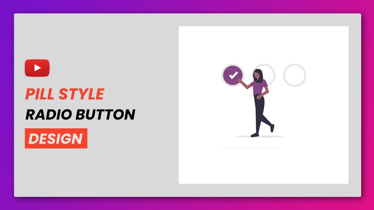
Pill Styled Radio Button Using HTML And CSS
We have created a lot of animated buttons, but in this article, we will treat the form's radio inputs as buttons and put animations on the inputs. If you want to see all the animations of the buttons, there is a playlist on this website named "Button Designs", be sure to visit that playlist.
So let's know, how this Pill-style input will be designed using HTML and CS. First three inputs will be taken, then a "label" will also be added via the "span" tag. After that this animation will be made with the help of box-shadow. When you click on the input you will see the shadow inside
You can read interesting articles on web development. The link is given below.
If you want to learn animation using javascript and jsplugins, We have already created a lot of animation using various plugins of javascript, check out the playlist. We hope you like it.
01. HTML STRUCTURE
<!DOCTYPE html>
<html>
<head>
  <title>Pill Styled Radio Button</title>
  <link rel="stylesheet" href="style.css">
</head>

<body>

    main content.

</body>
</html>
02. HTML
<!DOCTYPE html>
<html>
  <head>
    <title>Pill Styled Radio Button</title>
    <link rel="stylesheet" type="text/css" href="style.css">
  </head>
  <body>
    <div class="container">
      <form>
        <label>
        <input type="radio" name="radio" checked>
        <span>HTML</span>
        </label>
        <label>
        <input type="radio" name="radio">
        <span>CSS</span>
        </label>
        <label>
        <input type="radio" name="radio">
        <span>SCRIPT</span>
        </label>
      </form>
    </div>
  </body>
</html>
03. CSS
*, *::after, *::before{
  box-sizing: border-box;
}
body{
  font-family: sans-serif;
  color: #301930;
  font-size: 42px;
  background-color: #F3EDF3;
}
.container{
  position: absolute;
  top: 0px;
  left: 0px;
  right: 0px;
  bottom: 0px;
  width: 100%;
  display: -webkit-box;
  display: flex;
  -webkit-box-pack: center;
  justify-content: center;
  -webkit-box-align: center;
  align-items: center;
  padding: 20px;
}
form{
  display: -webkit-box;
  display: flex;
  flex-wrap: wrap;
  -webkit-box-orient: vertical;
  -webkit-box-direction: normal;
  flex-direction: column;
}
label{
  display: -webkit-box;
  display: flex;
  cursor: pointer;
  font-weight: 500;
  position: relative;
  overflow: hidden;
  margin-bottom: 6px;
}
label input{
  position: absolute;
  left: -9999px;
}
label span{
  display: -webkit-box;
  display: flex;
  -webkit-box-align: center;
  align-items: center;
  padding: 16px;
  border-radius: 90px;
  transition: 0.25s ease;
}
label span:hover{
  background-color: #EBE1EB;
}
label span::before{
  display: -webkit-box;
  display: flex;
  flex-shrink: 0;
  content: "";
  background-color: #fff;
  width: 48px;
  height: 48px;
  transition: 0.25s ease;
  box-shadow: inset 0px 0px 0px 2px #844685;
  border-radius: 50%;
  margin-right: 6px;
}
label input:checked + span{
  background-color: #EBE1EB;
}
label input:checked + span::before{
  box-shadow: inset 0px 0px 0px 8px #844685;
}
04. Youtube Video
Here I am attaching a YouTube video from my channel so that you can understand this article better and you can create a better web user interface. I have a lot of videos on my YouTube channel which is related to the user interface and web development. You can also, learn about web development from there.
05. SOURCE CODE
After reading this article and watching a Youtube video, if you want to download the source code, you can download it from here and change this according to your need.

Comments
Post a Comment