Grid Layout Responsive Website Design | Website Layout With Grid Concept | HTML And CSS
There are many ways to make a responsive website like flexbox, media-query, and grid concept. Before jumping to our main topic, let's learn about the responsiveness of a website because the main reason for this article is website responsiveness design, it's(responsiveness ) means when a user accesses any web page of a website using any device (like mobile, laptop, tablet, etc.) the content of web page must be clearly visible.
So many websites on the internet have good content but don't have a very good representation of text, images and heading because they don't have the responsiveness of web pages. Because of the lack of responsiveness, the content of a web page becomes messy and overlaps with each other. Because of that reason, visitors also have less engagement with that website. That has a bad impact on a website. It also decreases the ranking of websites.
Read Also: Difference Between Web Design And Web Development
Particularly In this article, we will learn one of the easy and simple ways to make a website page very responsive and well managed. To make a website proper responsive we have to use all those concepts like flexbox, and media query. Here, we will apply the concept of a responsive website using a grid and media query. Through the concept of Grid and Media Query, we will create a simple layout of a website that will responsive as well as space also assigned in a specific way.
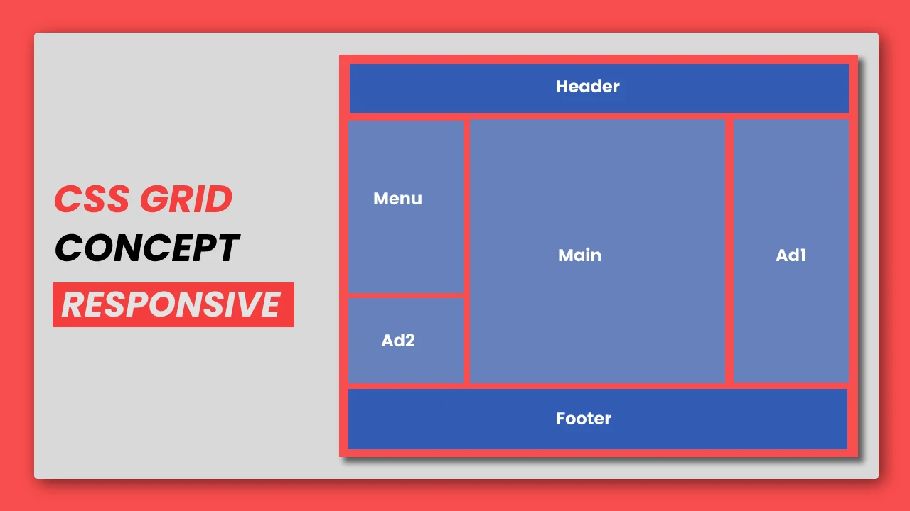
As you have already seen in the image we specify the space for each and every type of block in the design(like Header, Footer, Navigation bar, sidebar, main content and ads). Because of that, the place of each type of block becomes fixed and every visitor read each content in a specific manner.
To develop this page, we will use only a few properties of the grid concept so that we can create a normal layout. We hope you will like the article and learn some useful and you will learn all the terms of the grid concept in detail.
1. HTML STRUCTURE
Before starting to write html, css code, Let's try to understand the basic building block of the html document. The first line of html document shows the type of the document like its is html5 document or simple html document. There is a head tag that includes all the external file links(font-family, CSS, font-awesome, script), and metadata of the web page. Inside the body tag, we will write all the Html code that will be visible to the visitors. You can visit the introduction of html page.
<!DOCTYPE html>
<html>
<head>
  <title>Grid Layout Responsive Website Design | Rustcode</title>
  <style>
  </style>
</head>

<body>

  Content of the document.

<script type="text/javascript">
</script>

</body>
</html>
2. HTML
Now let's write the code which will be visible to every visitor on your web page. Here we are including one div that is the parent div and have class name "grid-container", There are six child elements, where each element has a different class name like item1, item2, item3....item6, etc.
<body>
   <div class="grid-container">
      <div class="item1">Header</div>
      <div class="item2">Menu</div>
      <div class="item3">Main</div>
      <div class="item4">Ad1</div>
      <div class="item5">Ad2</div>
      <div class="item6">Footer</div>
   </div>
</body>
3. CSS
Cascade style sheet(CSS) is used to beautify the html documents because html is not a programming language, it is just a markup language that shows the content of the element in the flow of html document tags. To align and place each and every element of the website page css will help us. So we are using the grid concept to implement responsive design and beautify the html document.
* {
   padding: 0px;
   margin: 0px;
   font-family: "Arial";
   font-weight: bold;
}

.grid-container {
   display: grid;
   grid-template-columns: 25% 50% 25%;
   grid-template-rows: 80px 80px 300px 100px 80px 150px;
   box-sizing: border-box;
   background-color: #EAF2E3;
}

.grid-container>div {
   margin: 4px;
   display: flex;
   justify-content: center;
   align-items: center;
}

.item1 {
   background-color: #F2A05D;
   grid-column: 1/4;
   grid-row: 1/2;
}

.item2 {
   background-color: #F2E863;
   grid-column: 1/2;
   grid-row: 2/4;
}

.item3 {
   background-color: #61E8E1;
   grid-column: 2/3;
   grid-row: 2/6;
}

.item4 {
   background-color: #F25757;
   grid-column: 3/4;
   grid-row: 2/6;
}

.item5 {
   background-color: #F25757;
   grid-column: 1/2;
   grid-row: 4/6;
}

.item6 {
   background-color: #F2A05D;
   grid-column: 1/4;
   grid-row: 6/7;
}
4. Media Query
media-query is used to make any webpage responsive. It means it decides the size of each block when the screen size change.
@media screen and (max-width: 850px) {
  .item2{
    grid-column: 1/4;
    grid-row: 2/3;
  }

  .item3{
    grid-column: 1/3;
    grid-row: 3/5;
  }

  .item4{
    grid-column: 3/4;
    grid-row: 3/6;
  }

  .item5{
    grid-column: 1/3;
    grid-row: 5/6;
  }
}

@media screen and (max-width: 500px) {

  .item3{
    grid-column: 1/4;
    grid-row: 3/4;
  }

  .item4{
    grid-column: 1/4;
    grid-row: 4/5;
  }

  .item5{
    grid-column: 1/4;
    grid-row: 5/6;
  }
}
5. YouTube Video
We create one youtube video also so that you can learn all the concepts and css grid properties in better way. In this video, each property implemented one by one.
6. SOURCE CODE
The source code is already uploaded to Github, you can download them but we recommend that you have to practice all these codes yourself.
If this article is useful and informative for you, share it. And if you have any doubt, please leave a comment.
- Attractive Profile Card Design | HTML And CSS
- Gaming CPU Landing Page Design Using GSAP | HTML, CSS And GSAP
- Navigation Bar With Hover Animation | HTML And CSS
- Mobile App Download Link Design | HTML And CSS
- Particle Background Animation | HTML, CSS And ParticleJs
- Show And Hide Password Animation | HTML, CSS And Javascript

Comments
Post a Comment