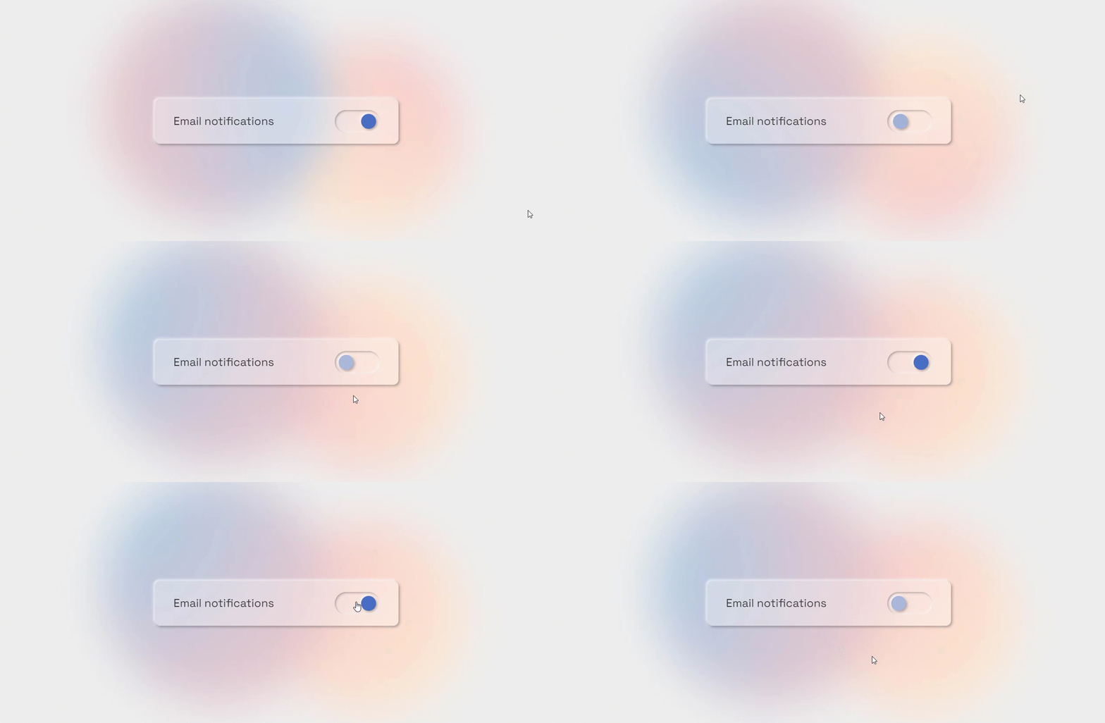
Neumorphism Notification Toggle Button Using Html Css Only
In the ever-evolving world of web design, creativity knows no bounds. As designers and developers continue to explore innovative ways to enhance user interfaces and user experiences, one design trend that has gained significant attention is Neumorphism. Neumorphism, often referred to as "soft UI" or "new skeuomorphism", combines elements of flat design and skeuomorphism to create visually appealing and tactile user interfaces.
In this article, we delve into the world of Neumorphism to create a Notification Toggle Button using only HTML and CSS. We'll explore how to achieve that distinctive Neumorphic look, ensuring both style and functionality are seamlessly integrated into your web projects. So, let's embark on a journey to craft an eye-catching and user-friendly notification toggle button that demonstrates the power of HTML and CSS in the realm of Neumorphism.
For more gsap animations you can follow the gsap playlist.
You can read more about web development from this playlist.
Table Of Contents
HTML:
Let's begin with the foundational structure of an HTML document, as depicted below.
<!DOCTYPE html>
<html>
<head>
  <title>Neumorphism Notification Toggle Button | Rustcode</title>
</head>
<body>

  // Content

</body>
</html>
Now that we have established the basic HTML structure and ensured that all necessary dependencies are included in the HTML document, it is time to proceed with writing the HTML code, which is provided below.
<!DOCTYPE html>
<html>
  <head>
    <title>Neumorphism Notification Toggle Button | Rustcode</title>
  </head>
  <body>
    <div class="bg-container">
      <div class="bg-1"></div>
      <div class="bg-2"></div>
    </div>
    <div class="wrapper">
      <div class="text">Email notifications</div>
      <input id="checkbox" type="checkbox" checked="checked"/>
      <label class="button" for="checkbox">
        <div class="dot"></div>
      </label>
    </div>
  </body>
</html>
Output:
Read Also:
- Announcement Popup Box Using PopboxJs | Rustcode
- Cursor Animation With Hover Effect Using GSAP | HTML, CSS And GSAP
- Custom Mouse Cursor Javascript | HTML, CSS And PointerJs
- Html Elements Smooth Drag And Drop Animation | HTML, CSS And Sortable
- Particle Background Animation | HTML, CSS And ParticleJs
- Portfolio Landing Page With Animation And Responsiveness | HTML, CSS, jQuery And GSAP
- Two Image Slider | HTML, CSS And JsPlugin
- Glitch Effect On Image | Html, Css And MgGlitchJs
- Glitch Effect On Text | Html And Css
CSS:
@import url("https://fonts.googleapis.com/css2?family=Space+Grotesk:wght@400;700&display=swap");

* {
  box-sizing: border-box;
}

html {
  font-size: 6.25vmax;
}

@media (max-width: 992px) {
  html {
    font-size: 60px;
  }
}

body {
  min-height: 100vh;
  display: flex;
  justify-content: center;
  align-items: center;
  color: #333;
  background-color: #eee;
  font-size: 0.3rem;
  font-family: "Space Grotesk", sans-serif;
  position: relative;
  overflow: hidden;
}

.bg-container {
  position: absolute;
  top: 0;
  left: 0;
  width: 100%;
  height: 100%;
  pointer-events: none;
}

.bg-container .bg-1 {
  position: absolute;
  top: 55%;
  left: 65%;
  width: 5rem;
  height: 5rem;
  transform: translate(-50%, -50%);
  background-image: radial-gradient(circle at 0 0, #f4c5cd, #ffeecf);
  border-radius: 5rem;
  animation: bg-container-move 8s infinite alternate;
  filter: blur(10px);
}

.bg-container .bg-2 {
  position: absolute;
  top: 45%;
  left: 40%;
  width: 6rem;
  height: 6rem;
  transform: translate(-50%, -50%);
  background-image: radial-gradient(circle at 0 0, #a1cae9, #f7c6c6);
  border-radius: 5rem;
  animation: bg-container-move 6s infinite alternate;
  filter: blur(10px);
}

.bg-container:after {
  content: "";
  position: absolute;
  top: 0;
  left: 0;
  width: 100%;
  height: 100%;
  backdrop-filter: blur(50px);
}

.wrapper {
  width: 6.5rem;
  border-radius: 12px;
  padding: 0.3rem 0.5rem;
  display: flex;
  justify-content: space-between;
  align-items: center;
  gap: 1rem;
  box-shadow: 3px 3px 6px rgba(0, 0, 0, 0.3), -3px -3px 6px rgba(255, 255, 255, 0.8);
  background-color: rgba(255, 255, 255, 0.3);
  z-index: 1;
}

input#checkbox {
  display: none;
}

input#checkbox:checked+.button {
  filter: none;
}

input#checkbox:checked+.button .dot {
  left: calc(100% - 0.4rem - 0.1rem);
  background-color: #4a6dc6;
}

.button {
  position: relative;
  width: 1.2rem;
  height: 0.6rem;
  border-radius: 1rem;
  box-shadow: inset 2px 2px 5px rgba(0, 0, 0, 0.3), inset -2px -2px 5px rgba(255, 255, 255, 0.8);
  cursor: pointer;
}

.button .dot {
  position: absolute;
  width: 0.4rem;
  height: 0.4rem;
  left: 0.1rem;
  top: 50%;
  transform: translateY(-50%);
  border-radius: 50%;
  box-shadow: 3px 3px 6px rgba(0, 0, 0, 0.3), -3px -3px 6px rgba(255, 255, 255, 0.8);
  transition: all 0.3s;
  background-color: #aab7d9;
  will-change: left, background-color;
}

@keyframes bg-container-move {
  to {
    transform: translate(-50%, -50%) rotate(360deg);
  }
}
Read Also:
Read Also:
- How to get unique values of an array using JavaScript
- How to get user screen size using javascript
- How to include one javascript file in another
- How to insert an item into an array at a specific index in JavaScript
- How to print hello world using javascript
- How to redirect to another page using javascript
- How to refresh page on specific time using javascript
- How to remove a property of JavaScript object
- How to remove a specific item from an array in javascript
- How to scroll to the top of the page using javascript
- How to set default argument values in JavaScript functions
- How to validate an email address Using JavaScript
- What is the reverse of the push function in javascript
- Write a JavaScript function to check if an input is an array
Youtube Video:
We also made a youtube video for "Neumorphism Notification Toggle Button Using Html Css Only", if you want to watch demo you can click on below video.
Read Also:
- Bookmark Interaction Animation | Html Css And Gsap
- Cursor Animation With Hover Effect Using GSAP | HTML, CSS And GSAP
- Full Screen Responsive Overlay Navigation Bar Design Using GSAP | HTML ,CSS And GSAP
- Gaming CPU Landing Page Design Using GSAP | HTML, CSS And GSAP
- Page Loading With Intro Using GSAP | HTML, CSS And GSAP
- Page Transition Animation Using GSAP | HTML, CSS And GSAP
- Portfolio Landing Page With Animation And Responsiveness | HTML, CSS, jQuery And GSAP
- Website Loader Animation Using GSAP | HTML, CSS And GSAP


Comments
Post a Comment