Image Visibility Animation Using Html Css And jQuery
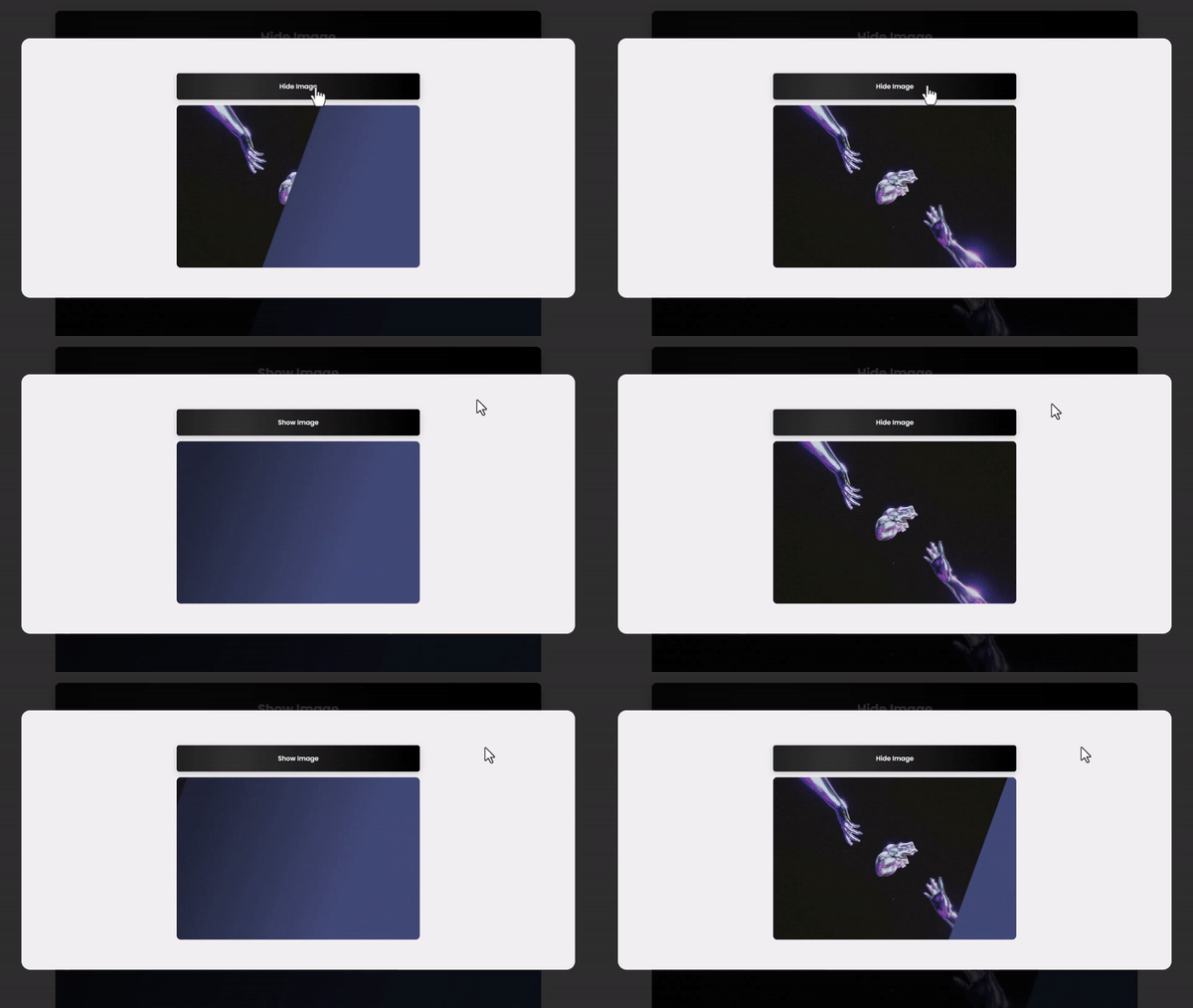
In this article, we will learn how to create a simple and fun animation for showing and hiding images on a web page using HTML, CSS, and jQuery. You don't need to be a coding expert to follow along. We'll break down the steps to make it easy for you to understand and implement on your own website. With this animation, you can add a touch of interactivity to your web pages, making them more engaging for your visitors. Let's get started! For gsap animations, you can follow the gsap playlist. You can explore further articles on web development by checking out this list.
Table Of Contents
HTML:
Let's begin with the foundational structure of an HTML document, as depicted below.
<!DOCTYPE html>
<html>
  <head>
    <title>Image Visibility Animation Using Html Css And jQuery</title>
  </head>
  <body>
    // Content
  </body>
</html>
You can incorporate all the required links and dependencies into the HTML document using the code snippet provided below.
<script src="https://ajax.googleapis.com/ajax/libs/jquery/3.4.1/jquery.min.js"></script>
Now that we have established the basic HTML structure and ensured that all necessary dependencies are included in the HTML document, it is time to proceed with writing the HTML code, which is provided below.
<!DOCTYPE html>
<html>
<head>
  <title>Image Visibility Animation | Rustcode</title>
  <link rel="stylesheet" href="style.css">
</head>
<body>

  <main class="wrapper">
  <button class="btn">Show Image</button>
  <div class="main-container">
    <div class="image-container">
      <div class="image"></div>
    </div>
  </div>
 </main>

<script src="https://ajax.googleapis.com/ajax/libs/jquery/3.4.1/jquery.min.js"></script>
<script src="script.js"></script>
</body>
</html>
-
<head> section: It contains the title of the web page and a link to an external CSS file named "style.css" for styling.
-
<body> section: The main content of the web page is within the <body> tag.
-
<main> element with a class "wrapper": This is a container for the content.
-
<button> element with a class "btn": This is a button with the text "Show Image." It's used to trigger an action.
-
<div> element with a class "main-container": This is a container for the image.
-
<div> element with a class "image-container": This is a container for the image element.
-
<div> element with a class "image": This is an empty container that can be used to display an image later.
-
<script> tags: These include JavaScript libraries and scripts for interactivity. The first <script> tag links to the jQuery library from Google's content delivery network, and the second <script> tag links to an external JavaScript file named "script.js".
CSS:
* {
  margin: 0;
  padding: 0;
  box-sizing: border-box;
  font-family: "Poppins", sans-serif;
}

.wrapper {
  width: 100%;
  min-height: 100vh;
  padding: 10px;
  display: flex;
  flex-direction: column;
  justify-content: center;
  align-items: center;
  background: #efefef;
}

.btn {
  position: relative;
  top: 80px;
  cursor: pointer;
  padding: 20px 40px;
  margin-bottom: 30px;
  border-radius: 6px;
  border: 0px;
  box-shadow: rgba(0, 0, 0, 0.15) 0px 5px 15px 0px;
  font-size: 16px;
  width: 600px;
  font-weight: 600;
  color: white;
  background: radial-gradient(circle at 24.1% 68.8%, rgb(50, 50, 50) 0%, rgb(0, 0, 0) 99.4%);
}

.main-container {
  width: 600px;
  height: 400px;
  position: relative;
  top: 0;
  bottom: 0;
  left: 0;
  right: 0;
  margin: auto;
  overflow: hidden;
  background: #111;
  border-radius: 10px;
  background: linear-gradient(112.1deg, rgb(32, 38, 57) 11.4%, rgb(63, 76, 119) 70.2%);
}

.image-container {
  width: 0px;
  margin-left: -100px;
  transform: skew(-20deg);
  transition: width 1s ease;
  overflow: hidden;
}

.main-container.show-img .image-container {
  width: 800px;
}

.image {
  width: 600px;
  height: 400px;
  margin-left: 100px;
  transform: skew(20deg);
  background-image: url("bg.jpg");
  background-size: cover;
  background-position: center;
  background-repeat: no-repeat;
}
-
The * selector applies the following rules to all elements on the page:
- Removes margin and padding to create a consistent layout (margin: 0; padding: 0;).
- Sets the box-sizing property to border-box, which ensures that element sizes include padding and borders.
- Specifies the "Poppins" font and a generic sans-serif font family for text.
-
The .wrapper class styles a container div:
- Makes it take up the entire width and at least the full viewport height (min-height: 100vh).
- Adds padding, centers its content both vertically and horizontally, and gives it a background color.
-
The .btn class styles a button element:
- Positions it relative to its original position (position: relative) and moves it down by 80px (top: 80px) to create a hover effect.
- Changes the cursor to a pointer when hovering over it.
- Sets padding, margin, border radius, box shadow, font size, font weight, and text color to style the button.
- Uses a radial gradient for the background.
-
The .main-container class styles another container div:
- Sets its width, height, and position to center it on the page.
- Clips content that overflows and gives it rounded corners.
- Applies a gradient background.
-
The .image-container class styles a container for an image:
- Initially, it has a width of 0px, making the image hidden.
- Uses skew and transition effects for animation.
- When the parent .main-container has the class .show-img, this container expands to a width of 800px.
-
The .image class styles the image itself:
- Sets its width, height, margin, and skew to create a visually interesting effect.
- Uses a background image ("bg.jpg") with specific background properties for size, position, and repetition.
Read Also:
SCRIPT:
$(document).ready(function() {
  console.log("document ready");
  $('.btn').on('click', function() {
    $('.main-container').toggleClass('show-img');
    $(this).text(function(i, text){
      return text === "Show Image" ? "Hide Image" : "Show Image";
    })
  })
});
-
It waits for the document to be fully loaded ($(document).ready(function() {...})).
-
When a button with the class .btn is clicked ($('.btn').on('click', function() {...})), it toggles the class .show-img on an element with the class .main-container. This class toggle makes an image either visible or hidden.
-
It also changes the text of the clicked button based on its current text. If the button's text is "Show Image", it changes it to "Hide Image" when clicked, and vice versa.
Read Also:
Youtube Video:
We also made a youtube video for "Image Visibility Animation Using Html Css And jQuery", if you want to watch demo you can click on below video.
Read Also:
- Bookmark Interaction Animation | Html Css And Gsap
- Cursor Animation With Hover Effect Using GSAP | HTML, CSS And GSAP
- Full Screen Responsive Overlay Navigation Bar Design Using GSAP | HTML ,CSS And GSAP
- Gaming CPU Landing Page Design Using GSAP | HTML, CSS And GSAP
- Page Loading With Intro Using GSAP | HTML, CSS And GSAP
- Page Transition Animation Using GSAP | HTML, CSS And GSAP
- Responsive Portfolio Landing Page | HTML, CSS, jQuery And GSAP
- Website Loader Animation Using GSAP | HTML, CSS And GSAP


Comments
Post a Comment