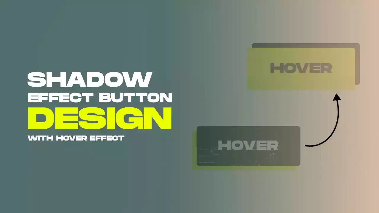
Button With Shadow Hover Effect Using Html Css Only
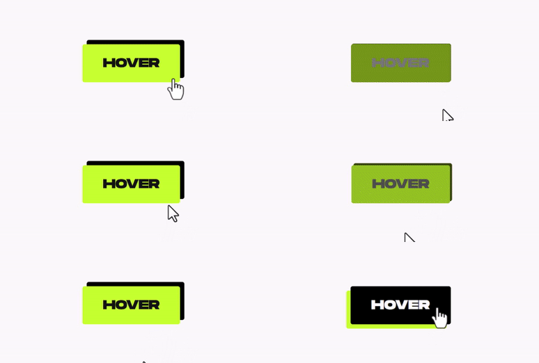
"Button With Shadow Hover Effect Using HTML and CSS Only" is a stylish and interactive design element that enhances user experience on web pages. Enhance your website's buttons with a visually appealing design featuring a distinct shadow effect. As users hover over these buttons, they transform gracefully, creating an engaging interaction where the shadow elegantly shifts in response. This simple technique allows you to improve the appearance and user experience of your website's buttons without the need for complex coding. For gsap animations, you can follow the gsap playlist. You can explore further articles on web development by checking out this list.
Table Of Contents
HTML:
Let's begin with the foundational structure of an HTML document, as depicted below.
<!DOCTYPE html>
<html>
<head>
  <title>Button With Shadow Hover Effect Using Html Css Only</title>
</head>
<body>

  // Content

</body>
</html>
You can add all the necessary links and things your webpage needs directly into the HTML using the code snippet below. Now that we've set up the basic HTML structure and made sure everything your webpage needs is included, let's move on to writing the HTML code. Here it is:
<!DOCTYPE html>
<html>
<head>
  <title>Button With Shadow Hover Effect | Rustcode</title>
  <link rel="stylesheet" href="style.css">
</head>
<body>

  <button class="btn">HOVER</button>

</body>
</html>
CSS:
body {
  margin: 0;
  height: 100vh;
  display: grid;
  place-items: center;
  background-color: #f9f9f9;
}

.btn {
  padding: 26px 48px;
  border: none;
  border-radius: 5px;
  background-color: #c4f327;
  color: #121212;
  font-size: 30px;
  font-weight: bold;
  font-family: "monument", sans-serif;
  cursor: pointer;
  transition: 0.15s;
  box-shadow: 10px -10px #000;
}

.btn:hover {
  box-shadow: -10px 10px #c4f327;
  color: #fbfbfb;
  letter-spacing: 1px;
  background-color: #000;
}

.btn:focus {
  outline: none;
}
-
body: Applies styles to the entire webpage body.margin: 0;: Removes any default margin.height: 100vh;: Makes the body 100% of the viewport height.display: grid;: Uses CSS Grid for layout.place-items: center;: Vertically and horizontally centers content.background-color: #f9f9f9;: Sets the background color to a light gray.
-
.btn: Applies styles to elements with the class "btn" (likely buttons).padding: 26px 48px;: Sets padding for top/bottom and left/right.border: none;: Removes borders.border-radius: 5px;: Rounds the corners.background-color: #c4f327;: Sets the background color to a bright green.color: #121212;: Sets text color to a dark gray.font-size: 30px;: Sets the font size.font-weight: bold;: Makes the text bold.font-family: "monument", sans-serif;: Defines the font family.cursor: pointer;: Changes the cursor to a pointer on hover.transition: 0.15s;: Adds a smooth transition effect.box-shadow: 10px -10px #000;: Adds a shadow with an offset.
-
.btn:hover: Applies styles when hovering over elements with the class "btn."box-shadow: -10px 10px #c4f327;: Changes the shadow on hover.color: #fbfbfb;: Changes text color to white.letter-spacing: 1px;: Increases letter spacing.background-color: #000;: Changes the background color to black.
-
.btn:focus: Applies styles when the button is focused.outline: none;: Removes the default focus outline.
Read Also:
Read Also:
Youtube Video:
We also made a youtube video for "Button With Shadow Hover Effect Using Html Css Only", if you want to watch demo you can click on below video.
Read Also:
- Bookmark Interaction Animation | Html Css And Gsap
- Cursor Animation With Hover Effect Using GSAP | HTML, CSS And GSAP
- Full Screen Responsive Overlay Navigation Bar Design Using GSAP | HTML ,CSS And GSAP
- Gaming CPU Landing Page Design Using GSAP | HTML, CSS And GSAP
- Page Loading With Intro Using GSAP | HTML, CSS And GSAP
- Page Transition Animation Using GSAP | HTML, CSS And GSAP
- Responsive Portfolio Landing Page | HTML, CSS, jQuery And GSAP
- Website Loader Animation Using GSAP | HTML, CSS And GSAP


Comments
Post a Comment