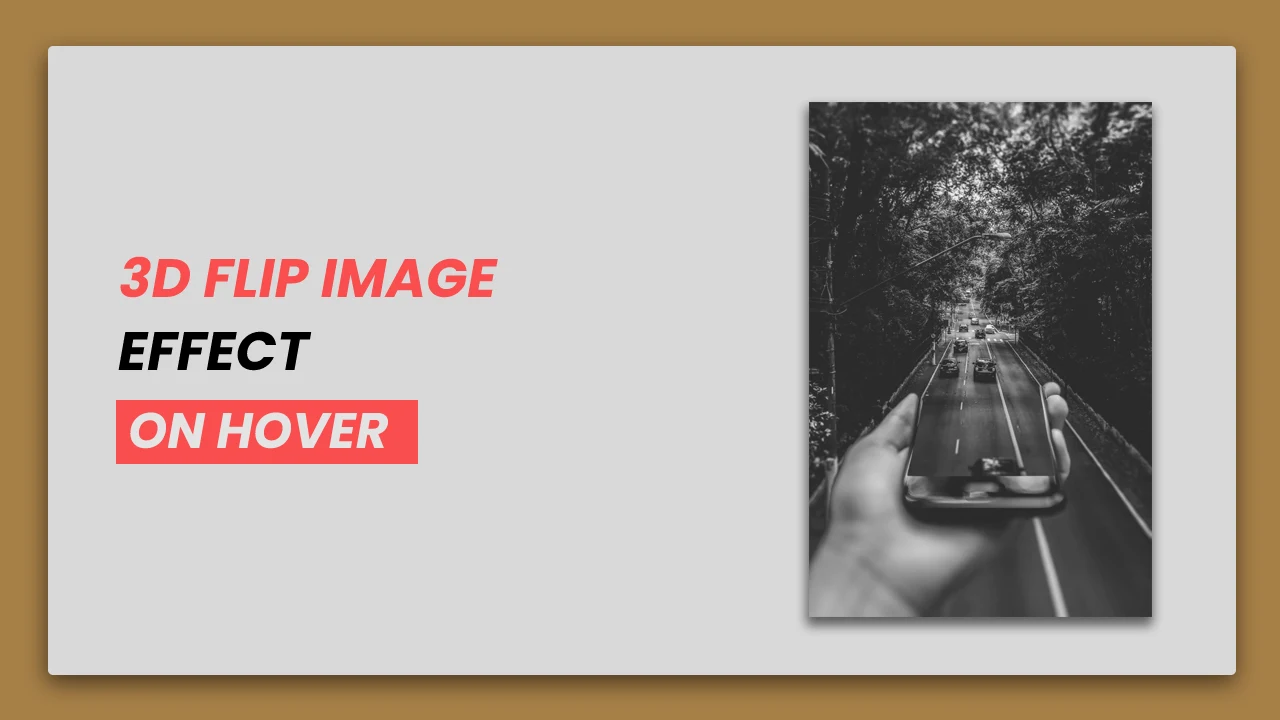
In web development, we can add a lot of animation to text, images, etc. We can use different libraries to include different types of effects but in this article, we are not using any type of libraries. To create this effect we will write simple CSS.
In this image effect, we will write code to flip the image vertically. So let's start with the code to create this effect, you can finally see a demo to this effect.
1. HTML STRUCTURE
<!DOCTYPE html>
<html>
<head>
  <title>3D Flip Image Effect On Hover | Rustcode</title>
  <link rel="stylesheet" href="style.css">
</head>

<body>

	main content.

</body>
</html>
2. CONTENT
We are also including an image in the blog card design. You can download that image from here.
<body>
   <div class="flip-box">
      <div class="flip-box-inner">
         <div class="flip-box-front">
            <img src="image.jpg" alt="image">
         </div>
         <div class="flip-box-back">
            <h2>IMAGE</h2>
            <p>Lorem ipsum dolor sit amet, consectetur adipiscing elit. Praesent vitae nibh mauris.
               Sed eget enim vehicula, suscipit neque ac, venenatis metus. In nec
               nunc scelerisque, vulputate mauris eget, accumsan tortor. Quisque dictum
               tellus quis lectus porttitor,ac pulvinar felis iaculis.
               Etiam eget nulla sit amet risus fringilla condimentum et pretium turpis.
             </p>
         </div>
      </div>
   </div>
</body>
3. CSS
body{
font-family: Arial, Helvetica, sans-serif;
background: #f1f1f1;
}

.flip-box{
width: 250px;
height: 400px;
position: absolute;
top: 50%;
left: 50%;
transform: translate(-50%,-50%);
border: 1px solid #f1f1f1;
border-radius: 4px;
box-shadow: 0px 4px 16px #111;
cursor: pointer;
perspective: 1000px;
}

.flip-box-inner{
position: relative;
width: 100%;
height: 100%;
text-align: center;
transform-style: preserve-3d;
transition: transform 0.8s;
}

.flip-box-inner img{
border-radius: 4px;
width: 250px;
height: 400px;
}

.flip-box-front, .flip-box-back{
position: absolute;
width: 250px;
height: 400px;
backface-visibility: hidden;
border-radius: 4px;
}

.flip-box:hover .flip-box-inner{
transform: rotateY(180deg);
}

.flip-box-back{
width: 250px;
height: 400px;
background-color: #4A5759;
color: white;
transform: rotateY(180deg);
}

.flip-box-back p{
text-align: justify;
margin: 6px 12px;
font-size: 12px;
line-height: 2;
letter-spacing: 0.3px;
}
READ ALSO:
4. Youtube Video
Here I am attaching a YouTube video from my channel so that you can understand this article better and you can create a better web user interface. I have a lot of videos on my YouTube channel which is related to the user interface and web development. You can also learn about web development from there.
5. SOURCE CODE
After reading this article and watching a YouTube video, if you want to download source code, you can download from here and change this according to your need.
RELATED POST:

Comments
Post a Comment