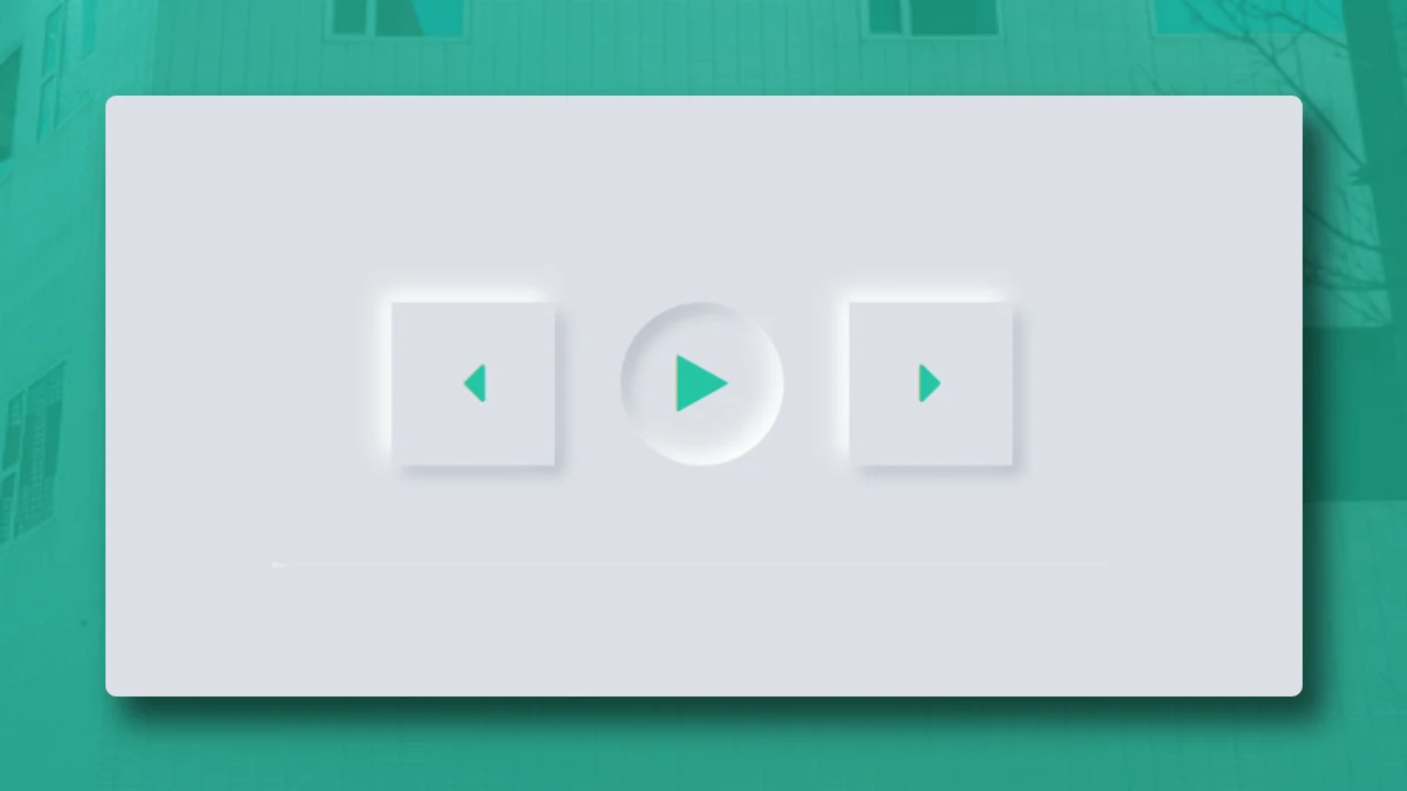
Neumorphic Music Control Button Design | HTML And CSS
There are a number of "neumorphic designs" topics already covered on this website you can visit them using this link. In this article, we will learn how to create the "Neumorphic Music Control Button" using simple html and css. That websites which are using this kind of effect looks very cool from a user interface perspective. And That is the main reason to design a good user interface.
There a numerous front-end website design articles available on this website that will help you improve your front-end concept of web development.
1. HTML STRUCTURE
<!DOCTYPE html>
<html>
<head>
  <title>Neumorphic Music Control Button Design | Rustcode</title>
  <link rel="stylesheet" href="style.css">
</head>

<body>

  main content.

</body>
</html>
2. FONT-AWESOME PLUGIN
This tutorial required one more library that is font-awesome because we are using the some icons that are really matters in this design. Music Button have icons, as you already seen the output. Now we include this library in html docment head tag. Link is given below.
<link rel="stylesheet" href="https://cdnjs.cloudflare.com/ajax/libs/font-awesome/4.7.0/css/font-awesome.min.css">
3. CONTENT
<!DOCTYPE html>
<html>
<head>
  <title>Neumorphism Effect</title>
  <link rel="stylesheet" href="https://cdnjs.cloudflare.com/ajax/libs/font-awesome/4.7.0/css/font-awesome.min.css">
  <link rel="stylesheet" href="style.css">
</head>

<body>

<div class="container">
 <div class="item-1"><i class="fa fa-caret-left"></i></div>
 <div class="item-2"><i class="fa fa-play"></i></div>
 <div class="item-3"><i class="fa fa-caret-right"></i></div>
</div>

</body>
</html>
4. CSS
* {
   margin: 0px;
   padding: 0px;
}

body {
   height: 100%;
   width: 100%;
   display: flex;
   justify-content: center;
   align-items: center;
   position: absolute;
}

.container {
   display: flex;
   flex-direction: row;
   justify-content: center;
   align-items: center;
   font-size: 250%;
   padding: 30px 80px;
   background: #DDE1E7;
   border-radius: 12px;
   box-shadow: -6px -6px 14px #ffffff, 6px 6px 10px rgba(94, 104, 121, 0.29);
}

.item-1,
.item-2,
.item-3 {
   display: flex;
   justify-content: center;
   align-items: center;
   height: 100px;
   width: 100px;
   background: #DDE1E7;
   border: 10px;
   box-shadow: -6px -6px 14px #ffffff, 6px 6px 10px rgba(94, 104, 121, 0.29);
   position: relative;
}

.item-2 {
   margin: 30px 40px;
   border-radius: 50%;
   box-shadow: inset -6px -6px 14px #ffffff, inset 6px 6px 10px rgba(94, 104, 121, 0.29);
}

.fa-caret-left,
.fa-caret-right,
.fa-play {
   color: #25C4A3;
}

.item-1:active,
.item-3:active {
   box-shadow: inset -6px -6px 14px #ffffff, inset 6px 6px 10px rgba(94, 104, 121, 0.29);
}

.item-2:active {
   box-shadow: -6px -6px 14px #ffffff, 6px 6px 10px rgba(94, 104, 121, 0.29);
}
Read More: 15+ Awesome Button Animations
5. Youtube Video
We have create one youtube video on this article. You can watch and learn step by step process how we achieve the result. We hope it will be very helpful for you.
Read Also: Three Ways To Add Css In Html Document
6. SOURCE CODE
We have github repository for all this code, you can download code file from there also but we suggest if you really want to improve your skills, please do it yourself. There are no restrictions to use these code in your projects. Use it and modify accordingly.

Comments
Post a Comment