Weather Report Card Design | HTML, CSS And Bootstrap
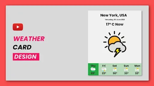
"weather report card" is a very commonly used car that is mostly used by weather forecasting websites. Apart from this, you can use this card as a weekly schedule also but you have to use a different image.
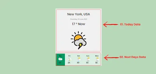
To develop this weather card we are using the two rows concept(flex-box). One row is used for today's weather data and the next row is used for further days. And to design the next day's link we are using the "flex-box" concept because it has both image and text.
If you want to know more about this type of design tutorials you can follow our playlist, the is given below:
01. Include Bootstrap Link
First look at html document which looks like below structure.
<!DOCTYPE html>
<html>
  <head>
    <title>Weather Report Card Design | Rustcode</title>
  </head>
  <body>
   // html code
</body>
</html>
Now we include the bootstrap link into this HTML document. In head, we will add bootstrap css and font-awesome files. Here we are not using any javascript function so no need to add a script link but if you want to add then add it to the bottom of the HTML document.
Bootstrap Link:
<link rel="stylesheet" href="https://stackpath.bootstrapcdn.com/bootstrap/4.1.3/css/bootstrap.min.css">
Font-awesome Link:
<link rel="stylesheet" href="https://cdnjs.cloudflare.com/ajax/libs/font-awesome/4.7.0/css/font-awesome.css"/>
Now, this HTML document is ready to use bootstrap and the final structure will look like the below document..
<!DOCTYPE html>
<html>
<head>
    <title>Weather Report Card Design | Rustcode</title>
    <link rel="stylesheet" type="text/css" href="style.css">
    <link rel="stylesheet" href="https://stackpath.bootstrapcdn.com/bootstrap/4.1.3/css/bootstrap.min.css">
    <link rel="stylesheet" href="https://cdnjs.cloudflare.com/ajax/libs/font-awesome/4.7.0/css/font-awesome.css"/>
</head>

<body>
  // html code
</body>
</html>
02. HTML
we divide this card into two rows which we already discussed at the starting of this article.
01. Today's Data
02. Next Days Data
As you can see in the image that each row has different content of weather card.
01. Today's Data: This row includes the location of the weather, the temperature in degrees, the date and time as well as photos related to weather.
02. Next Days Data: This row contains the temperature in degrees of the weather, the day name as well as the pictures related to the weather.
Now you know the layout and basic flow of the weather Report card so now you can code with bootstrap classes. You can download all required images from here.
<!DOCTYPE html> <html> <head> <title>Weather Report Card Design | Rustcode</title> <link rel="stylesheet" type="text/css" href="style.css"> <link rel="stylesheet" href="https://stackpath.bootstrapcdn.com/bootstrap/4.1.3/css/bootstrap.min.css"> <link rel="stylesheet" href="https://cdnjs.cloudflare.com/ajax/libs/font-awesome/4.7.0/css/font-awesome.css"/> </head> <body> <div class="container mx-auto"> <div class="row d-flex justify-content-center"> <div class="card text-center pt-4 border-0"> <h3 class="mt-2">New York, USA</h3> <small class="text-muted mt-2 mb-3">Thursday, 03 June 2021</small> <h3>17 ° Now</h3> <div class="text-center mt-3 mb-3"> <img src="front-image.png" class="front-img"> </div> <div class="row d-flex px-3 mt-auto"> <div class="d-flex flex-column day-container active"> <small class="text-muted mb-0">Thu</small> <div class="text-center"> <img src="cloud-rain.png" class="weather-img"> </div> <h6><strong>23 ˌ</strong></h6> </div> <div class="d-flex flex-column day-container"> <small class="text-muted mb-0">Fri</small> <div class="text-center"> <img src="thunder.png" class="weather-img"> </div> <h6><strong>23 ˌ</strong></h6> </div> <div class="d-flex flex-column day-container"> <small class="text-muted mb-0">Sat</small> <div class="text-center"> <img src="sun-rain.png" class="weather-img"> </div> <h6><strong>30 ˌ</strong></h6> </div> <div class="d-flex flex-column day-container"> <small class="text-muted mb-0">Sun</small> <div class="text-center"> <img src="cloud-air.png" class="weather-img"> </div> <h6><strong>33 ˌ</strong></h6> </div> <div class="d-flex flex-column day-container"> <small class="text-muted mb-0">Mon</small> <div class="text-center"> <img src="cloud-air.png" class="weather-img"> </div> <h6><strong>32 ˌ</strong></h6> </div> </div> </div> </div> </div> </body> </html>
This code is not ready yet only html is done because the default design of Bootstrap is working. We will add our css in next step.
03. CSS
Because of Bootstrap, we are writing very small CSS as Bootstrap has predefined classes which make web development work easy. So let's see the CSS code. There are three main methods to include css in HTML documents.
@import url('https://fonts.googleapis.com/css2?family=Poppins:wght@500;600;700');
*{
  font-family: "Poppins", sans-serif;
  box-sizing: border-box;
  border-radius: 0px !important;
}

body{
  display: flex;
  align-items: center;
  height: 100vh;
  background: #B8D8BA !important;
}

.day-container{
  width: 20%;
  background: #D9EEE1;
  cursor: pointer;
  padding: 10px 0px;
}

.day-container.active,
.day-container:hover{
  background: #059862;
}

.front-img{
  width: 200px;
  height: 200px;
}

.weather-img{
  width: 40px;
  height: 40px;
}

.card{
  width: 400px;
  background: #f1f1f1 !important
}

.day-container > small{
  color: #000 !important;
  font-weight: bold;
}

@media screen and (max-width: 400px) {
  .card{
    width: 98%;
  }
}
04. Youtube Video
it is very interesting that we can design this kind of animation with bootstrap in a very easy way. You can refer to the youtube video if you want to learn this concept in depth.
05. Source Code
We have also added the source code of this bootstrap design, if you want to download that code then click on the link below.


Comments
Post a Comment